Colors
Colors Exploration Project

Colors is a personal project and a bit of an exploration exercise in color palette design. The way we perceive imagery and color varies greatly from person to person.
Images hold a wealth of color palette options. But it’s really based on how we perceive an image and what colors matter to each of us.
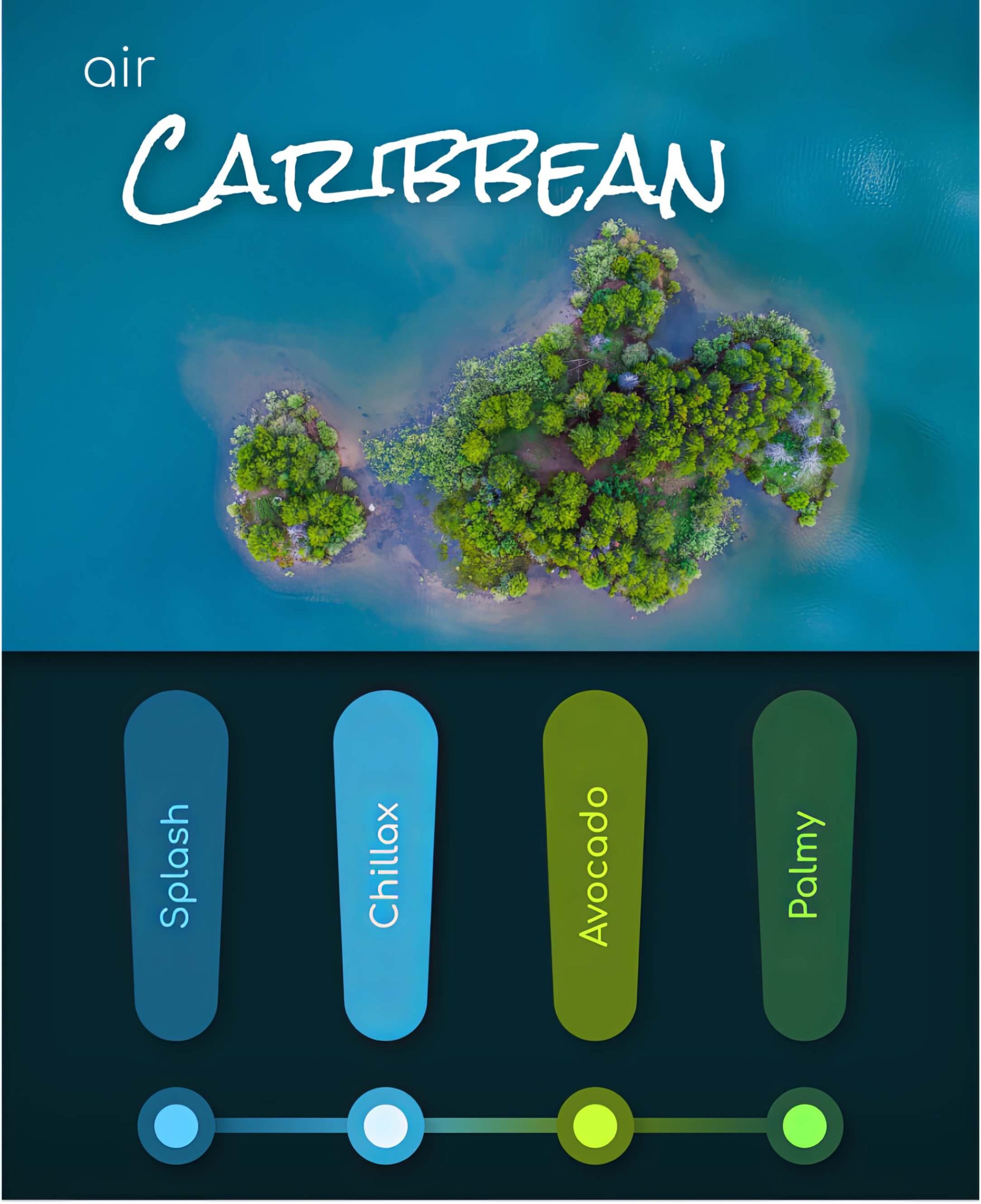
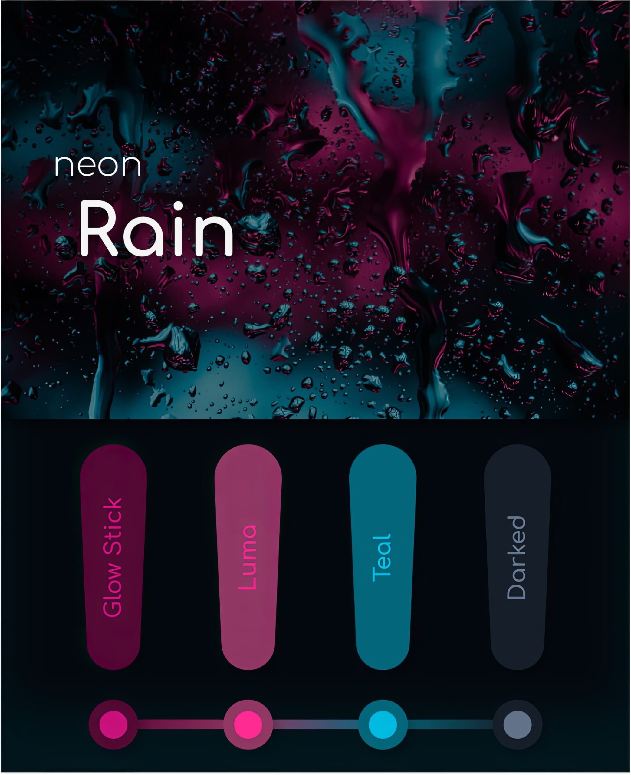
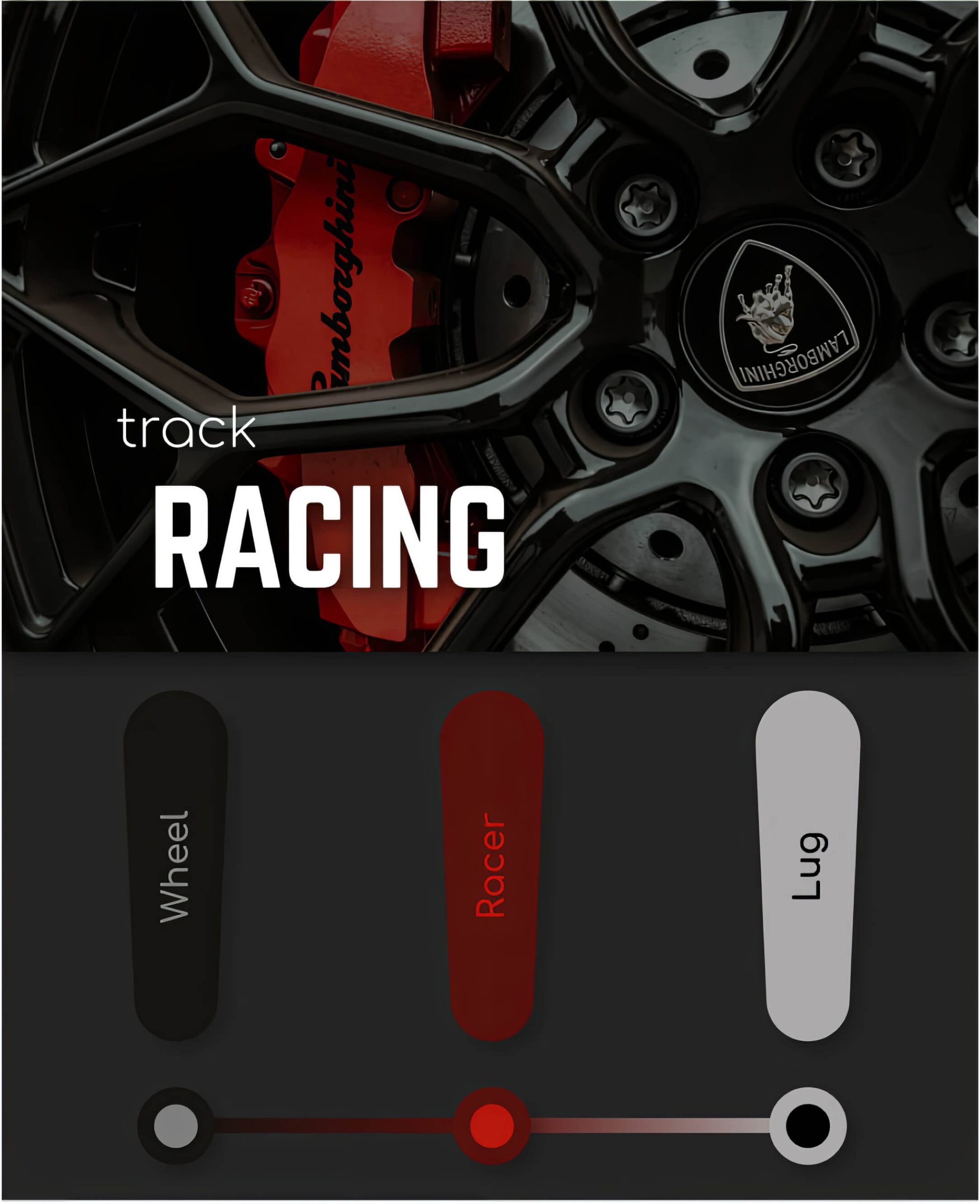
I have created three unique color palettes that are based on some of my favorite images. Each color bar contains a font color and a complimentary background color.
Air Caribbean
Air Caribbean is based on one of my favorite Caribbean images. Color is interpreted subjectively. I wanted to choose colors that, when blended into a palate, feel both cool and exhilarating.

Neon Rain
Neon Rain is based on an image I found when I was doing some research on abstract images. The boldness of the image inspired me to create a color palate that exemplified the creative possibilities within minimalistic photos.

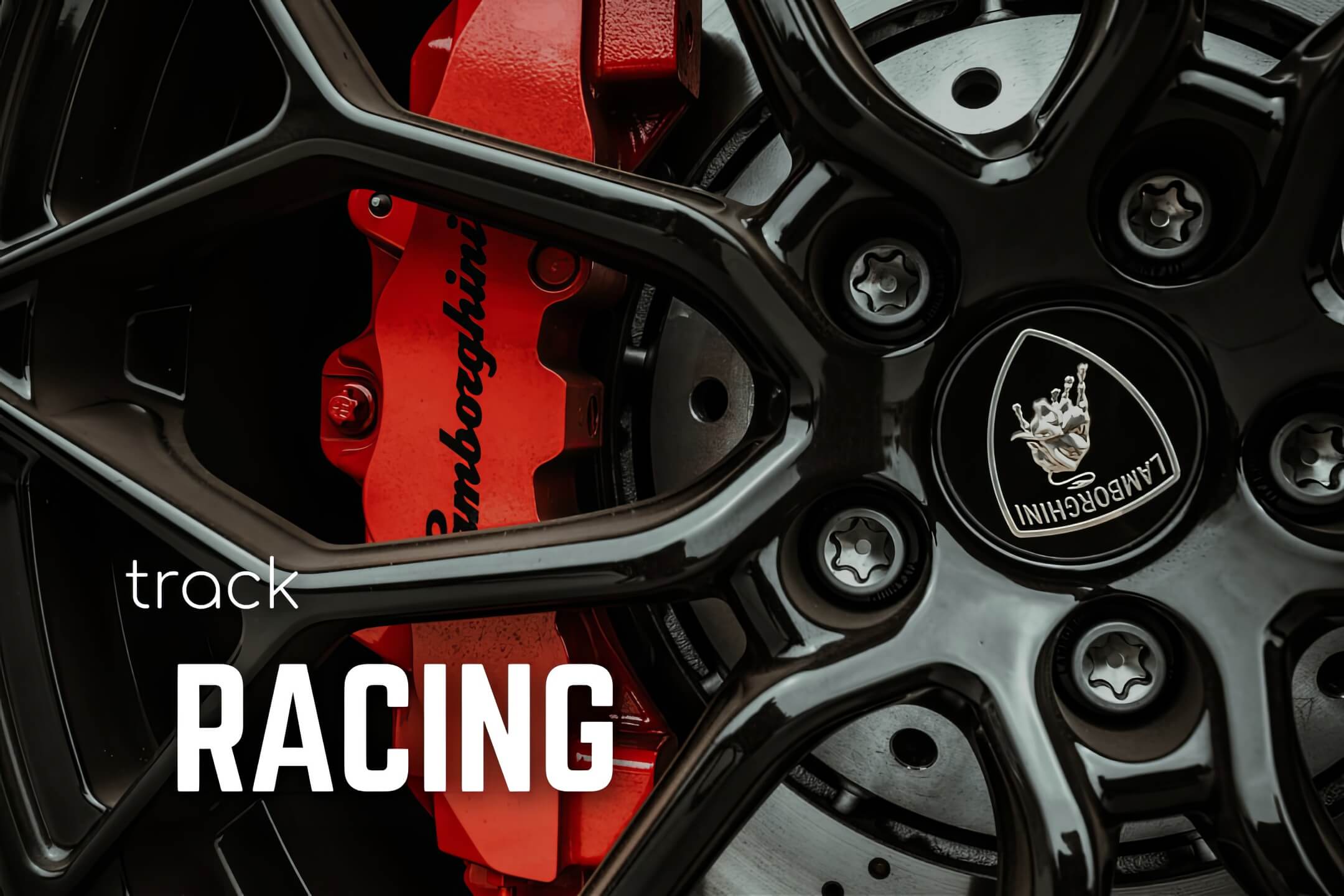
Track Racing
The image used in this color palette represents boldness, power, and speed. I perceived the Lamborghini as the perfect blend of aesthetics and minimalism and wanted to create a palette that felt the same.

The Outcome
The Colors project was an incredible opportunity to reconnect with color theory and creativity with a fresh approach. The question moving forward will be not where can I place an image, but rather, what can I extract from an image.
