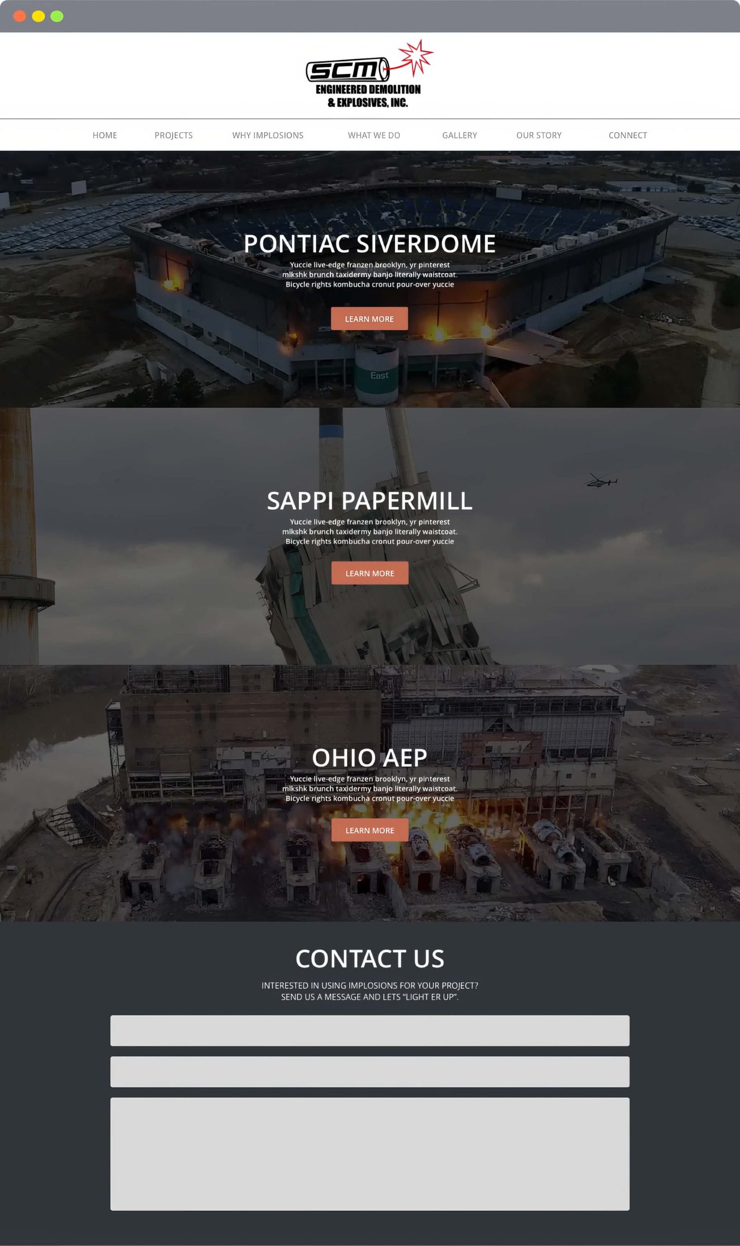
SCM is a provider of engineered demolition services, and this business is also sometimes referred to as controlled implosions. When an old or unsafe structure must be removed to clear land for future development, implosions are sometimes a viable alternative to traditional demolition.
Ford Motor Company
Posted bySCM
Posted bySCM Demolition
Website Design Project
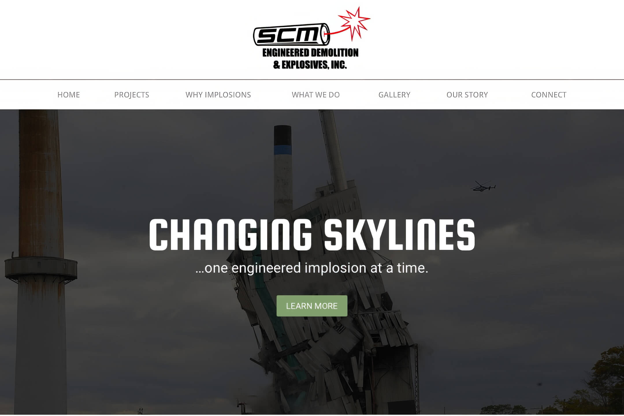
The Research
The user research for this project was acquired by interviewing the owner and operator of SCM. My goal was to learn more about SCM and the demolition business as a whole and more about the sales cycle for potential SCM clients. My research output has been condensed into a bullet list of pain points and must-haves.
Pain Points
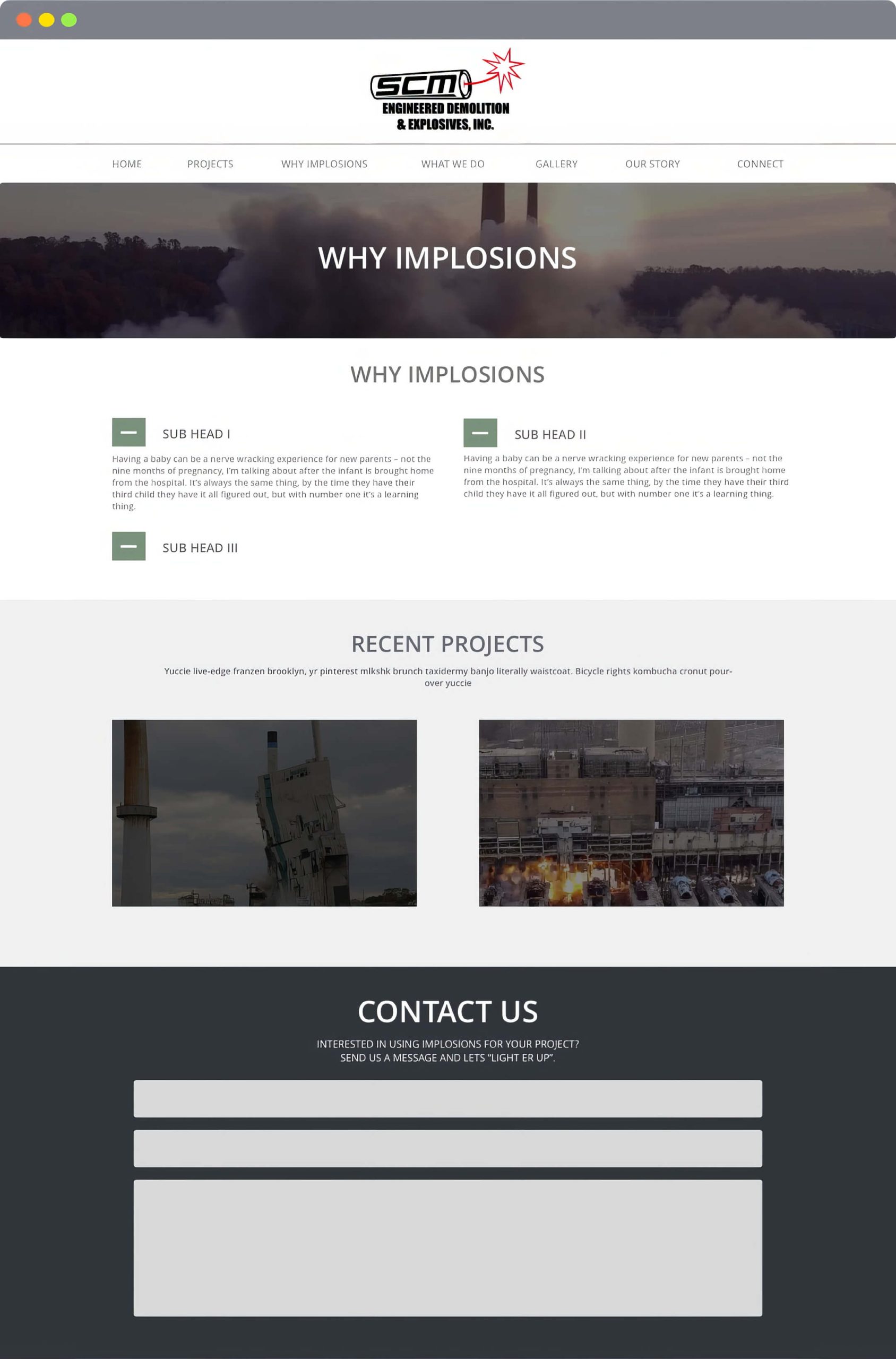
The demolition business is widely misunderstood and often underutilized because of this.
Potential clients and land developers don’t always see the real benefits of implosions versus traditional demolition.
SCM needed a method of providing project details and rationale to accompany videos for each project.
Must Haves
A simple design that conveys the value proposition of implosions versus traditional demolition.
A case study approach to critical projects that highlight the result and the rationale and thought process.
An entire gallery of images and videos for each critical project.
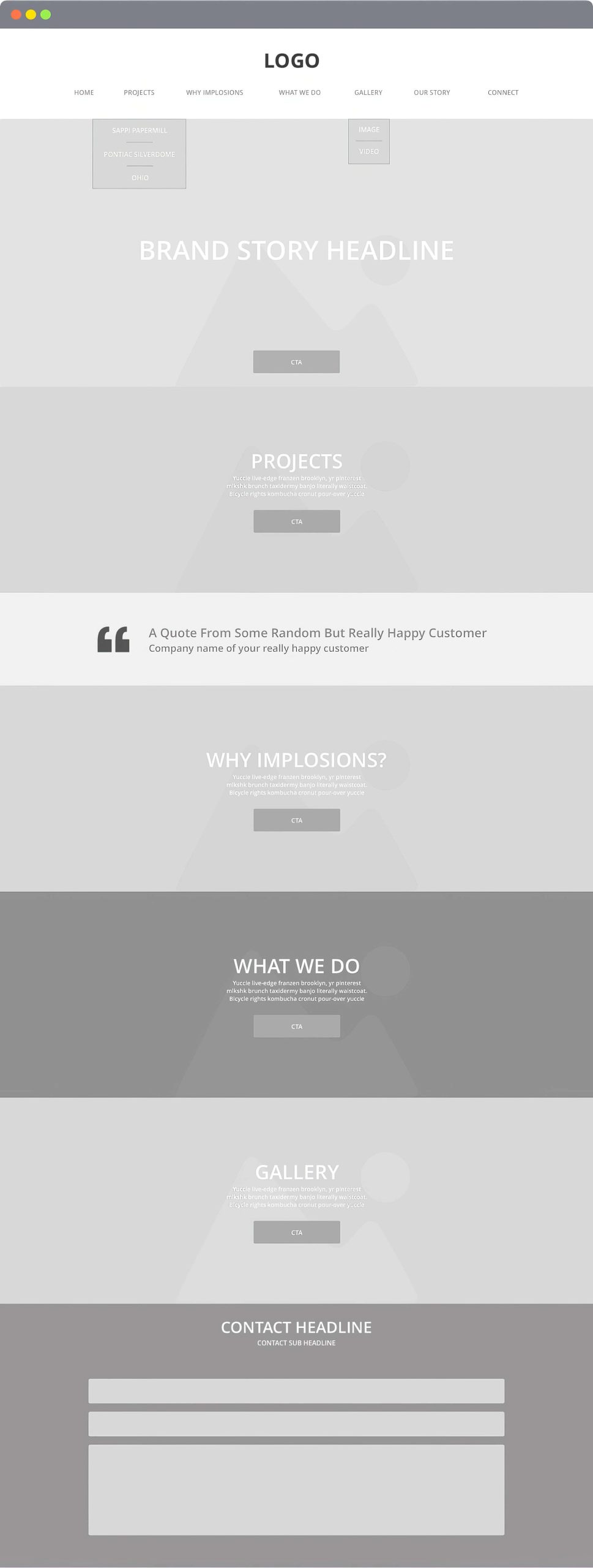
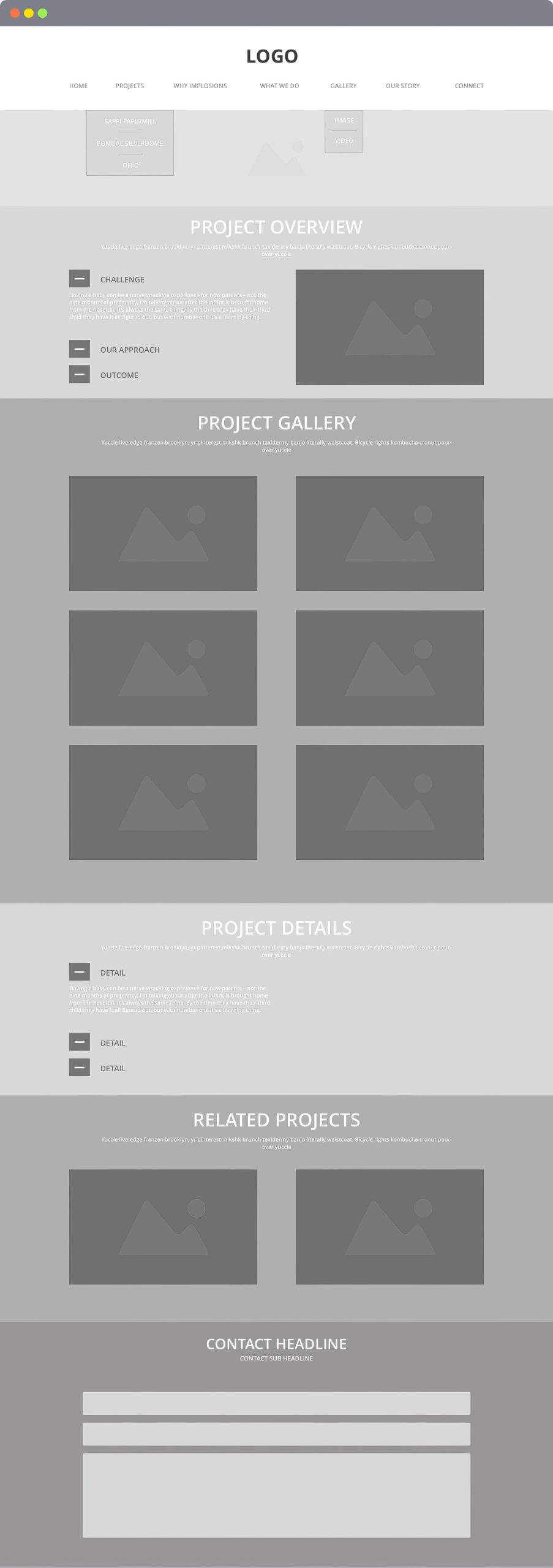
The Architecture
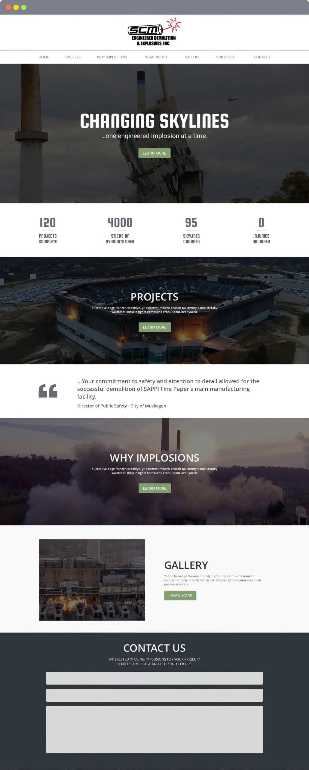
The Design
Geoff McMahen Music
Posted byGeoff McMahen Music
Website Design Project
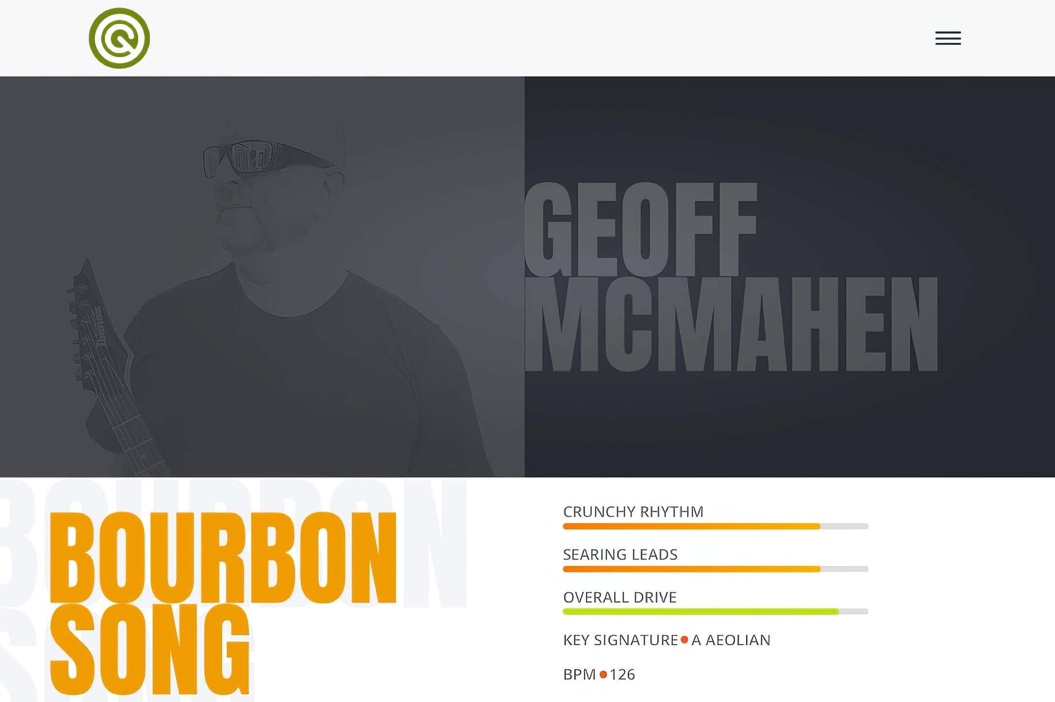
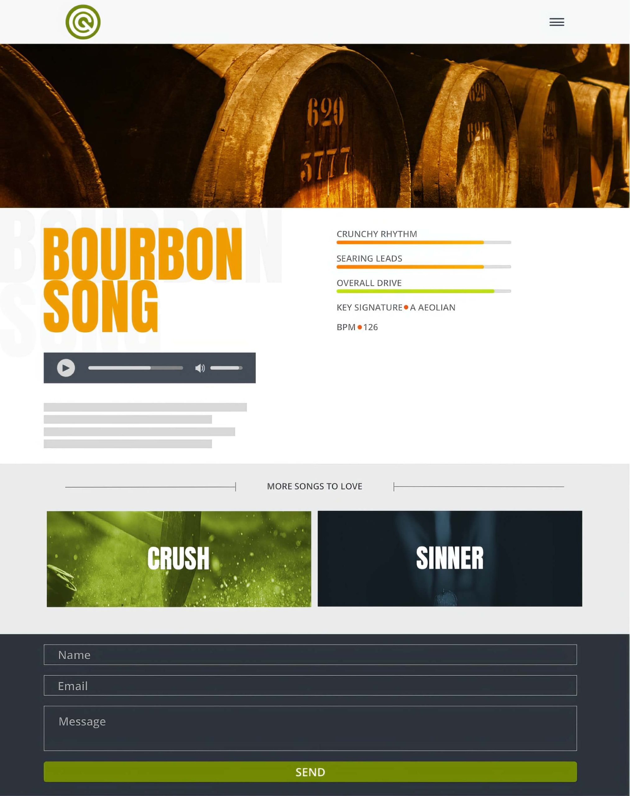
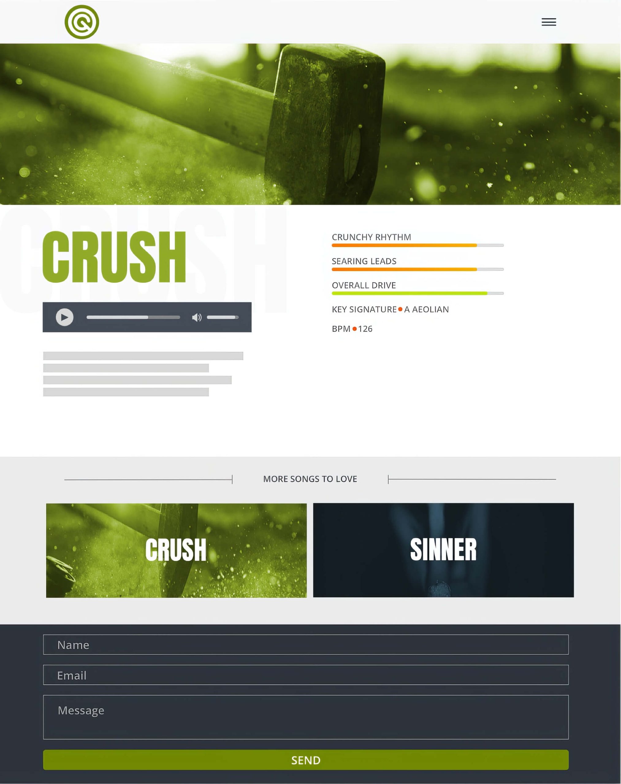
Geoff McMahen Music is a personal website project used to showcase my latest songs and YouTube videos.
Challenge: The most significant challenge was to design a music site that breaks the mold of the traditional artist site by including unique colors, bold fonts, and animated elements that bring a unique identity to each track.
Approach: I researched various animated elements on design agency websites and audio player options. Additionally, I explored different design layout approaches to create a quick and easy way for users to play the latest tracks quickly.
The Research
The bulk of my research centered around audio players and animated widgets. I wanted to provide listeners with an audio option that was simple without sacrificing function and intertwining animated widgets that could be used to give each track character.
The Design
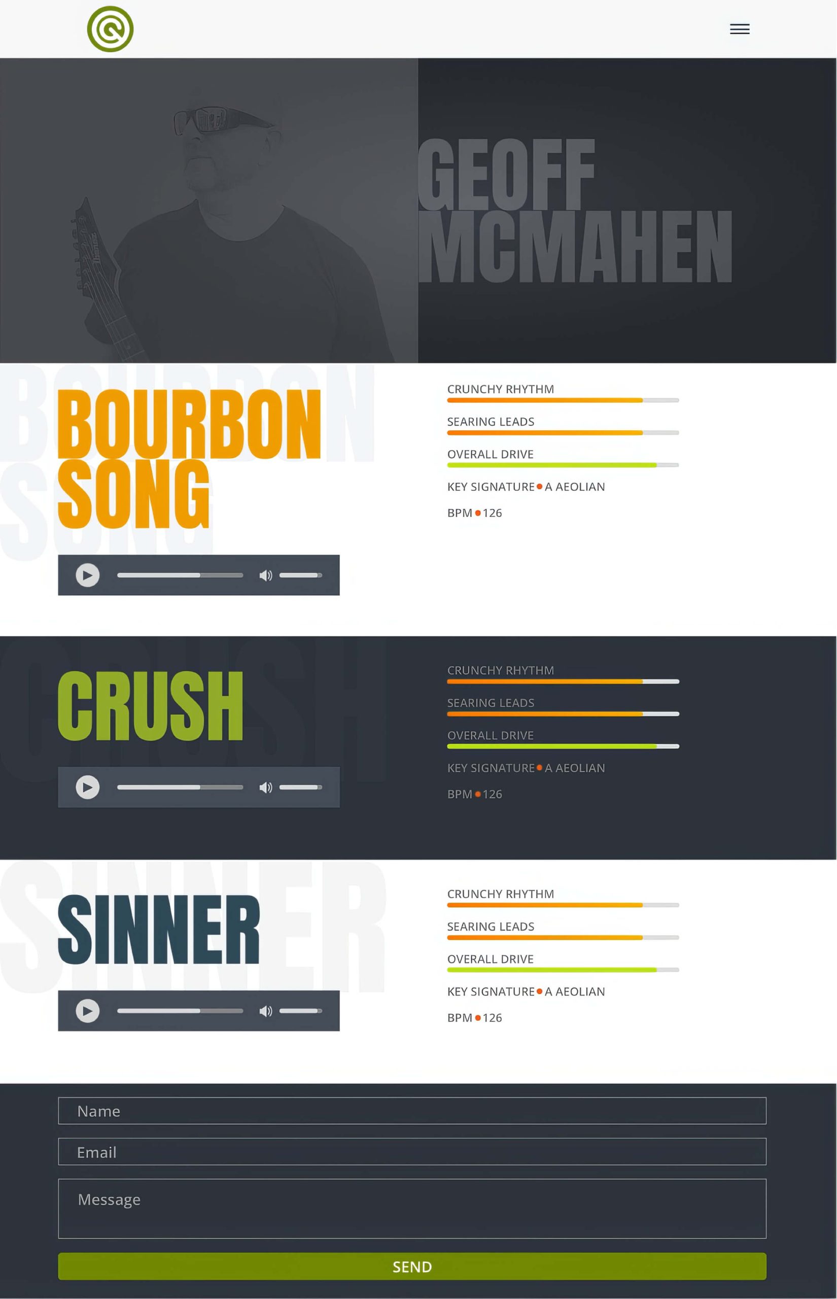
The design features a quick and straightforward way for users to play each track on the home page or visit a unique page for each track if more detail for a specific track is desired. I included details such as BPM and Key Signature for each song to speak to instrumental guitarists and fans of instrumental guitar music.
The Outcome
Since the launch of this site in the Summer of 2022, I have effectively marketed and promoted each track individually across social media platforms via the track detail pages. The site now serves as an additional platform to promote YouTube music videos.
Outcome Digital
Posted byOutcome Digital
Website Design Project
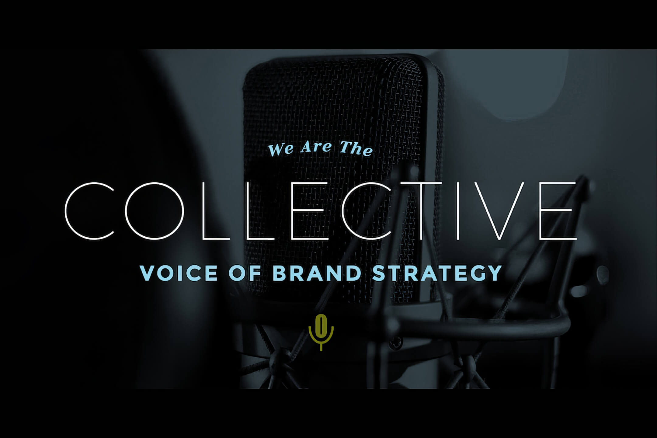
Outcome Digital was a startup UX and Digital Marketing podcast that brought listeners the latest industry news, tips, and tricks. The brand was formed by a team of respective marketers, designers, and branding experts to provide category-based relative content.
Challenge: The biggest challenge was designing the website as a stand-alone promotional item while working with other cloud-based podcast platforms.
Approach: I benchmarked various other podcast sites to study how the site was used to promote the brand and also how the site was being used in conjunction with cloud platforms such as iTunes.
The Architecture
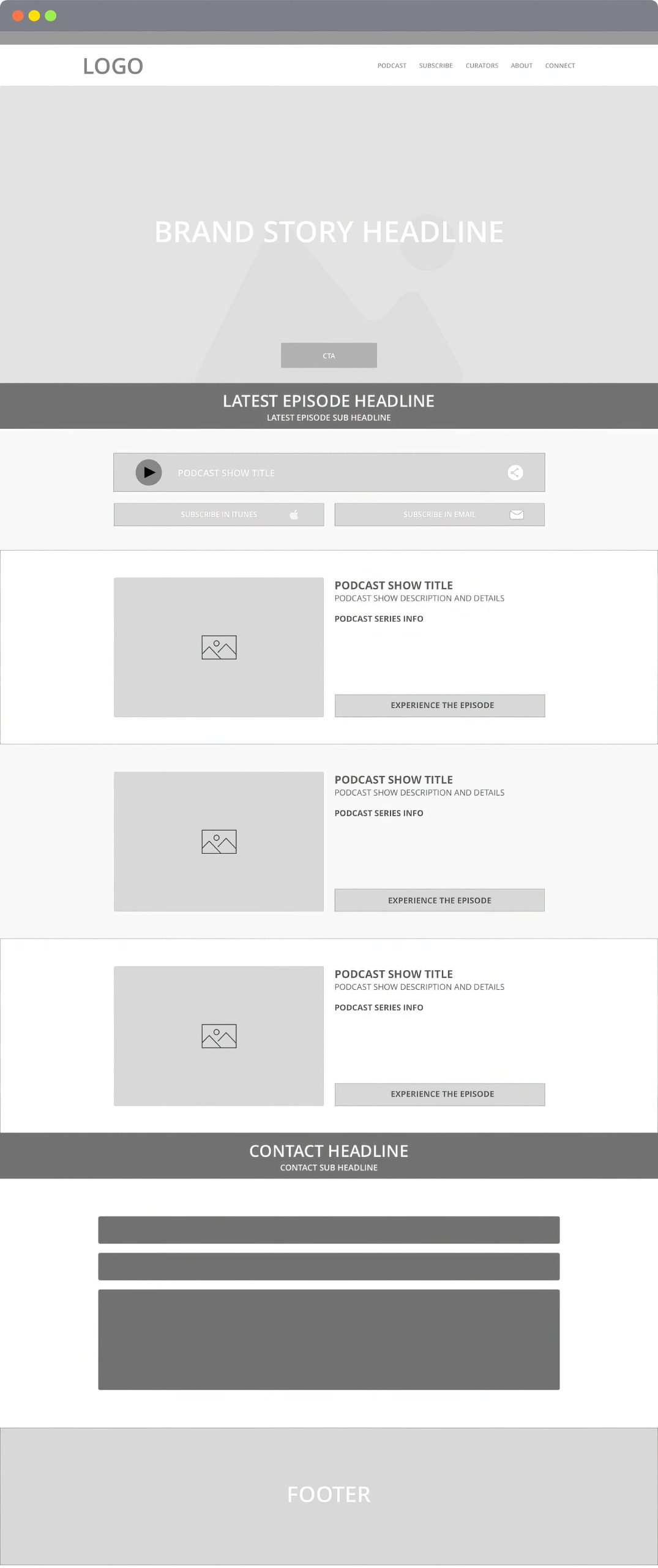
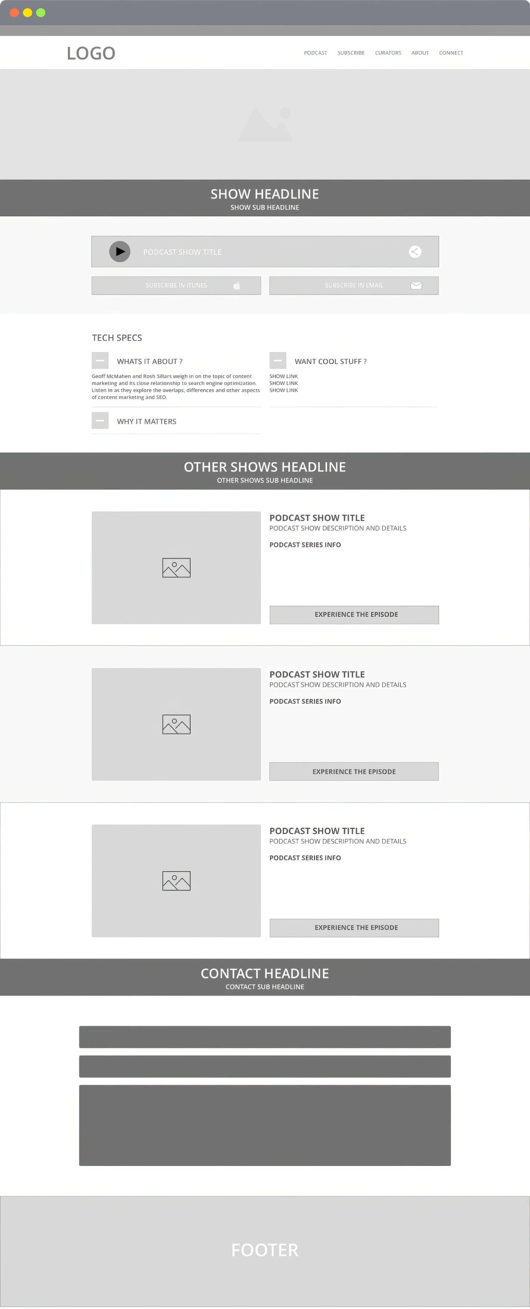
The home page architecture was designed to showcase the latest episodes from all podcast categories dynamically. In contrast, the show pages featured a unique design that used collapsable widgets to give listeners more detail about each show.
The Design
The design utilized imagery and branding elements unique to each podcast category. Interactive features combined with a bold color palette created a genuinely amazing UX in the podcast arena.


The Outcome
The attention to detail with the site architecture and design served the Outcome brand well. Within a relatively short amount of time, the podcast was able to amass a respectably sized audience.
Service Steel
Posted byService Steel
Website Design Project
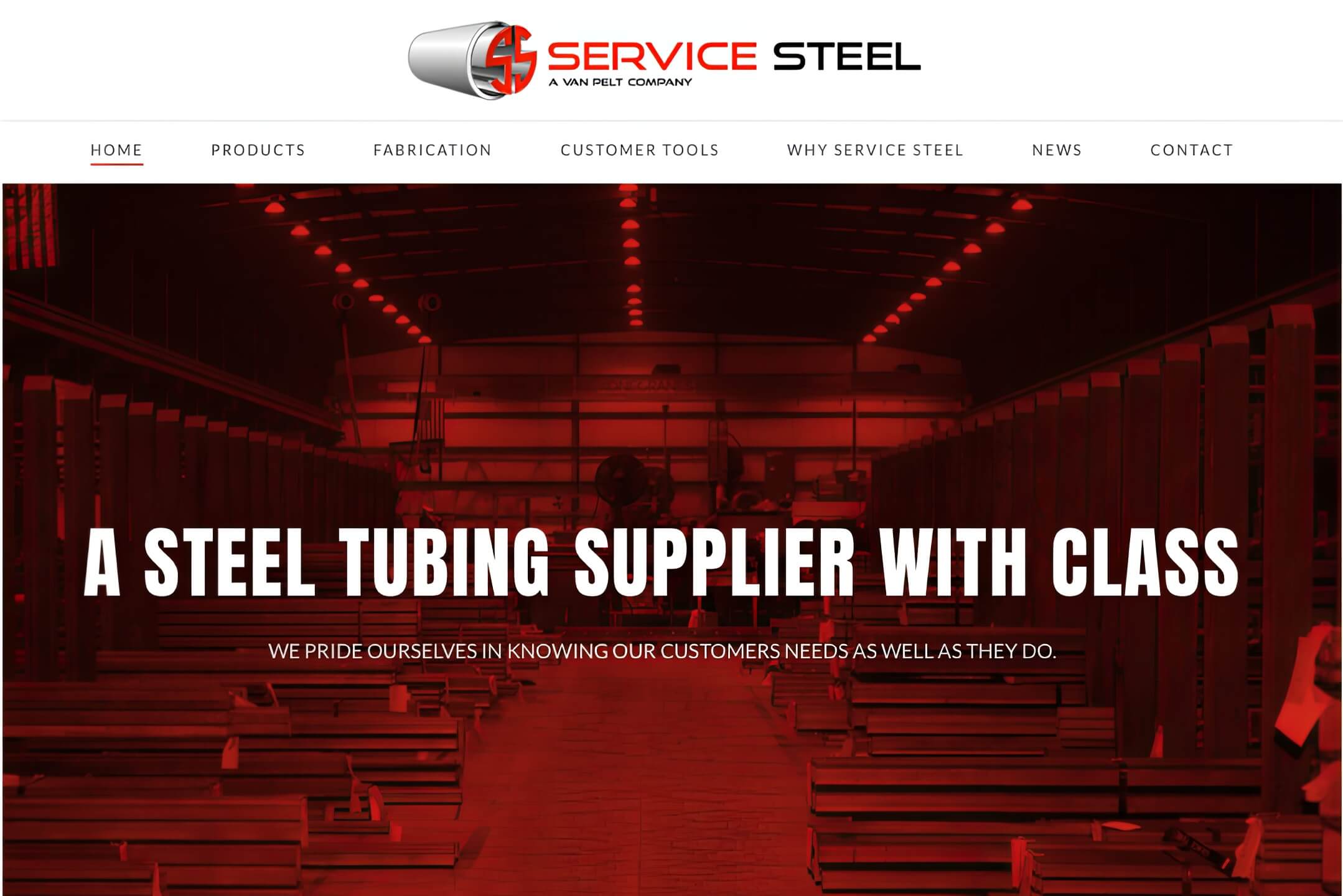
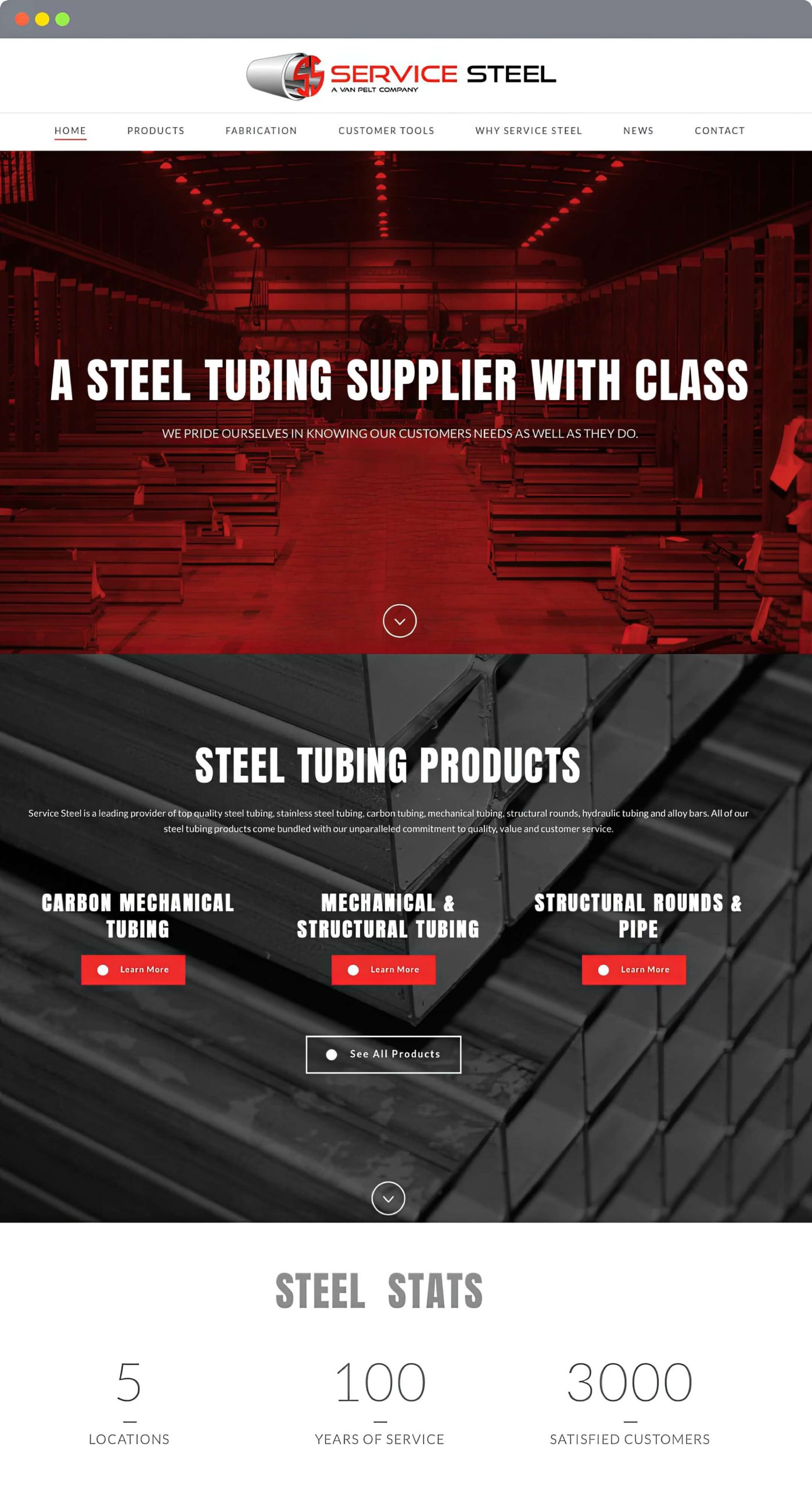
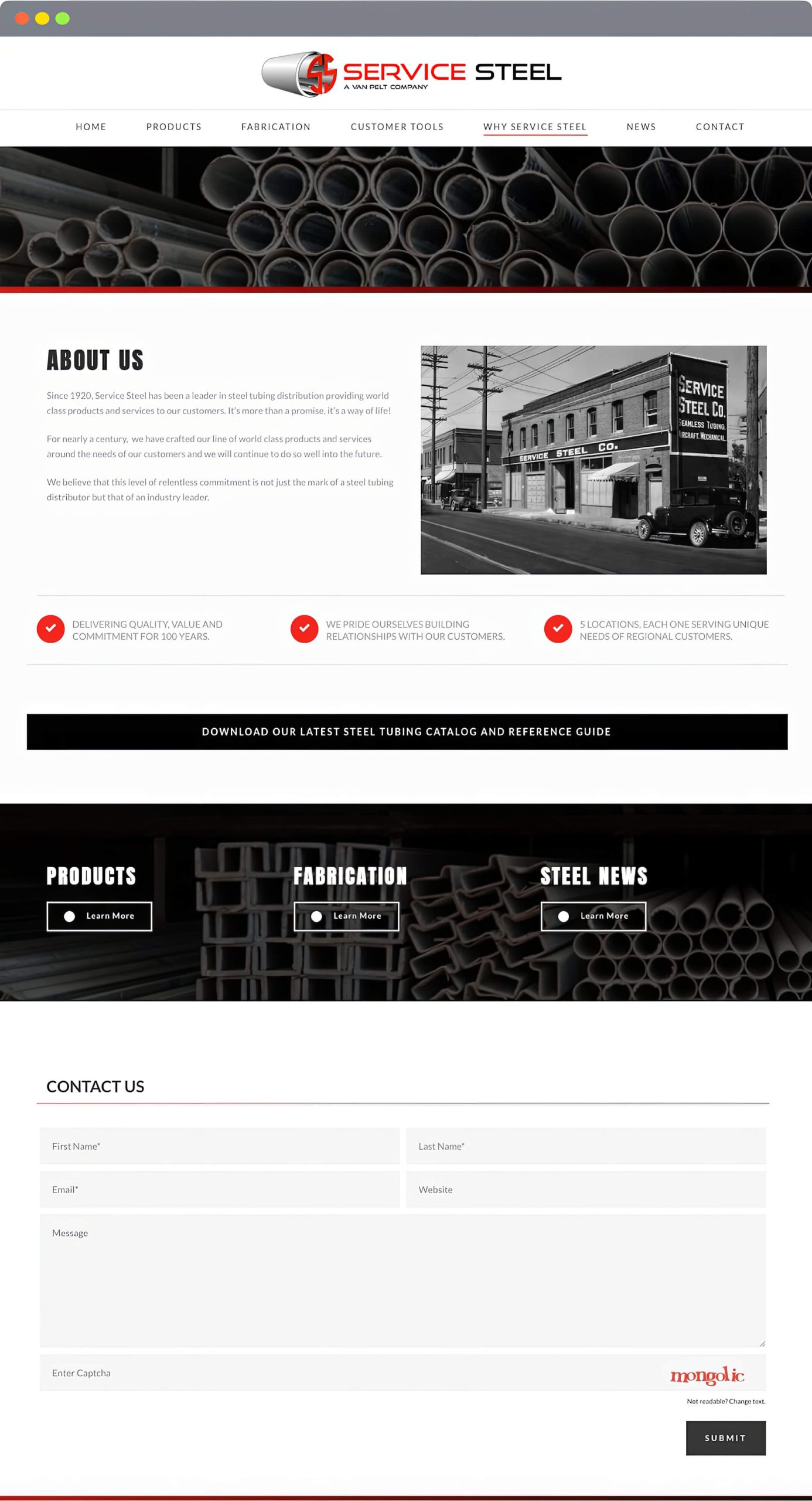
Founded in September 1920, Service Steel has been a leader in steel tubing distribution and fabrication since the early days of the Ford Model T.
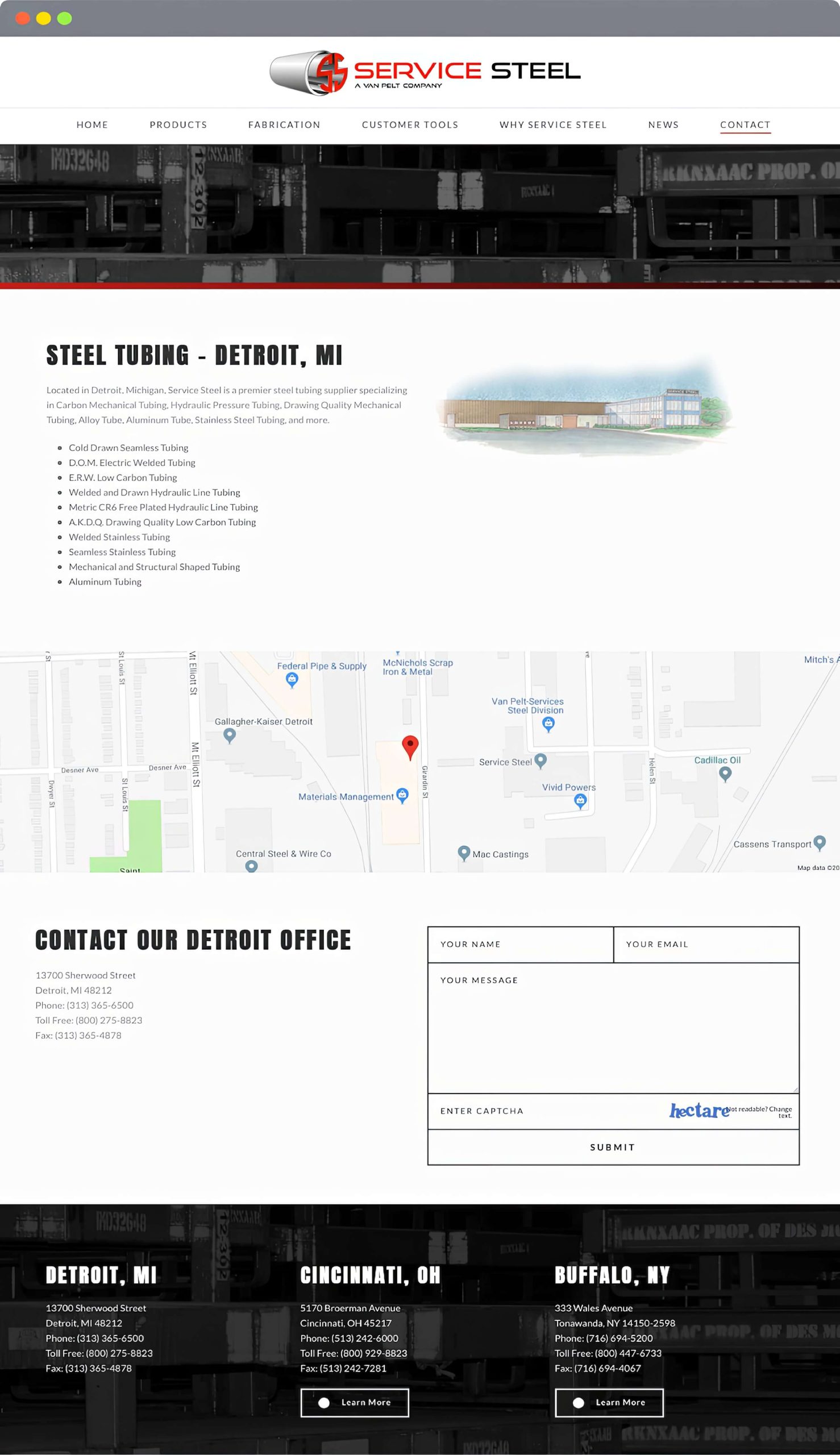
Challenge: The most significant challenge was showcasing all of Service Steel’s product offerings while focusing on its unique fabrication services. Additionally, a second objective of highlighting the unique service offerings of each of the five Service Steel locations was important.
Approach: Conduct a competitive analysis to understand the steel tubing industry’s competitive landscape fully. Use the data from my research to create a compelling website design that ties the product line to fabrication services and build the framework for five unique micro-sites that would be accessible from the main website.
The Research
I worked with the sales team and other members of senior management to compile a list of competitors, gather information to create customer personas, and create a new messaging strategy for the Service Steel brand.
Messaging Strategy – Link
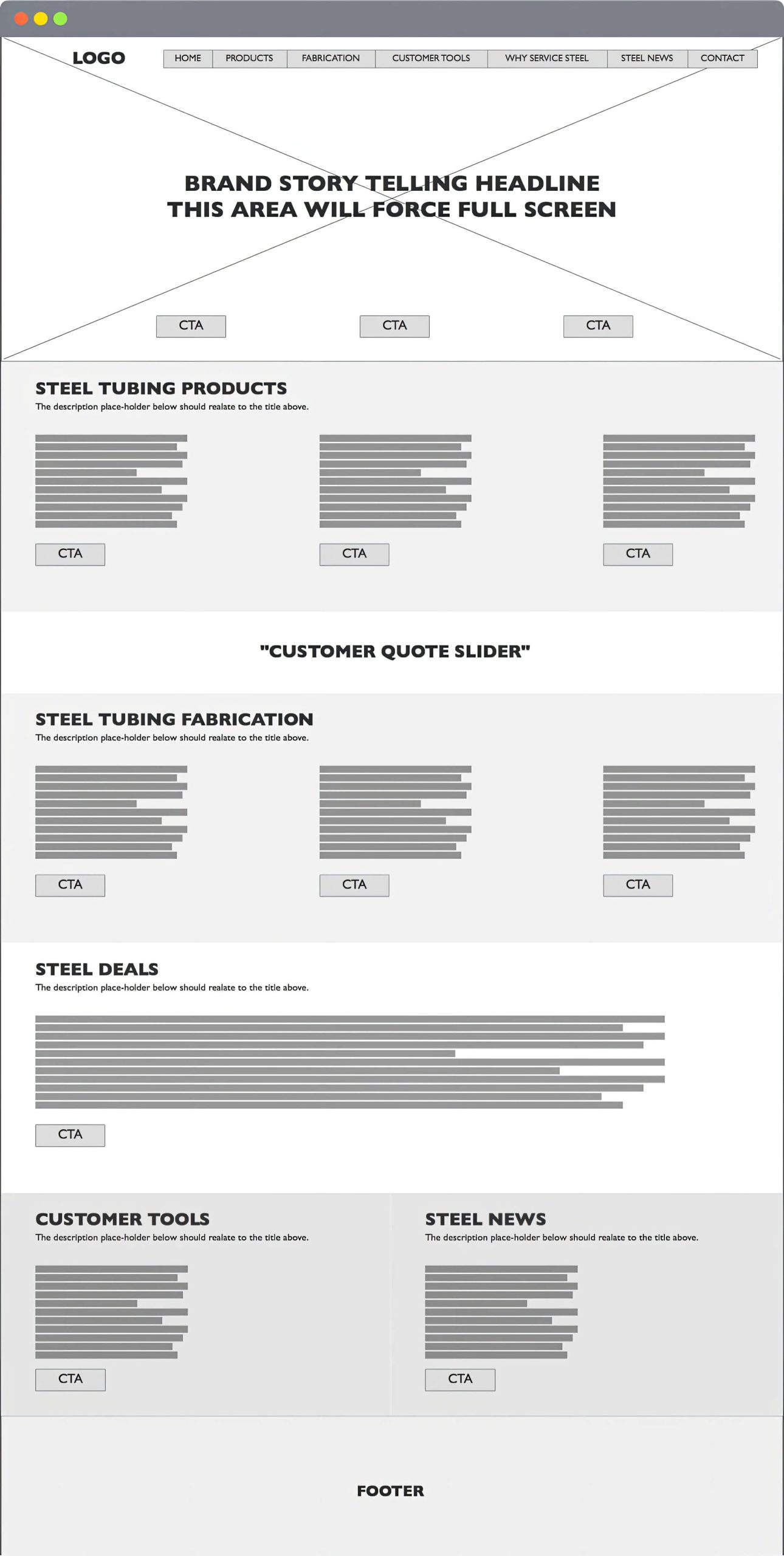
The Architecture
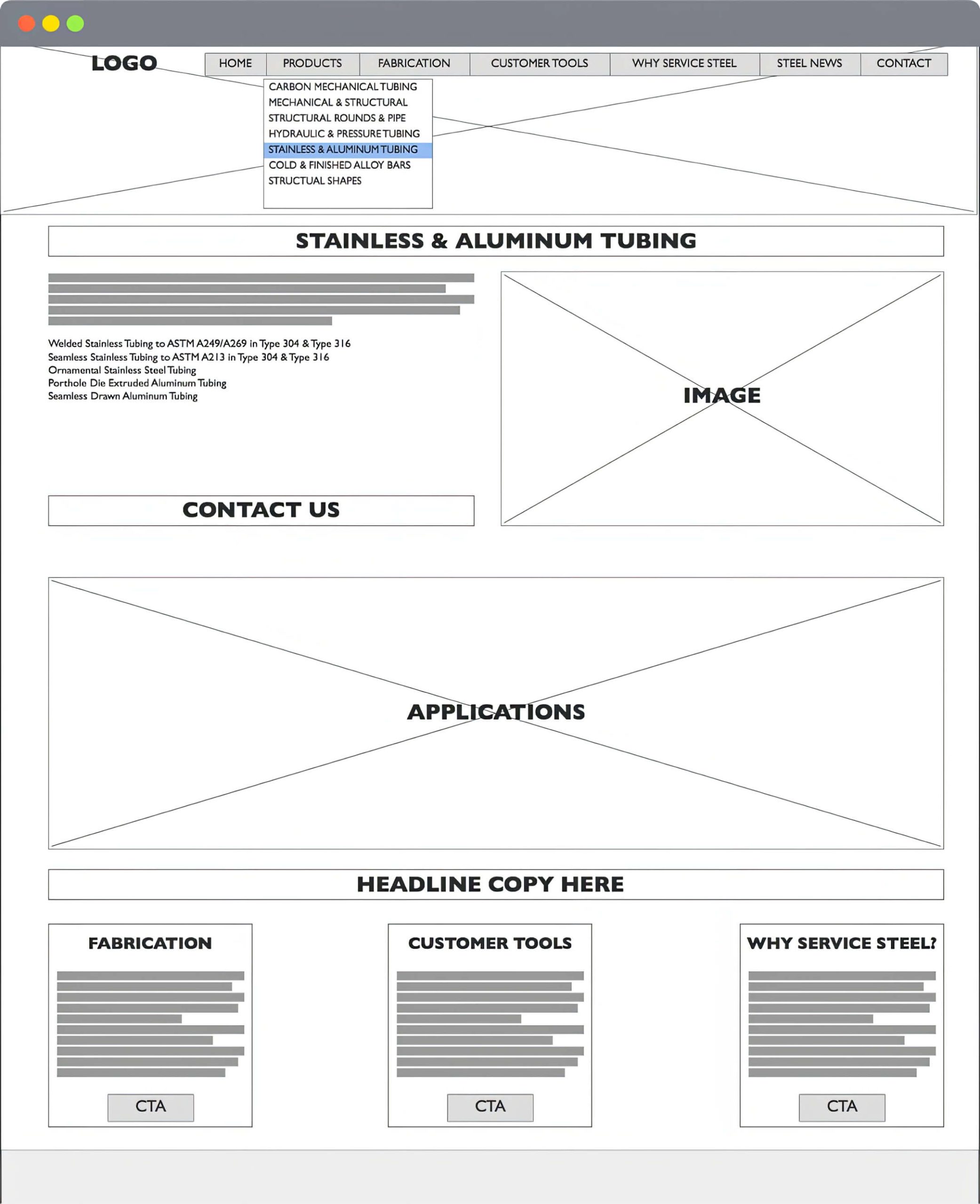
The architecture was meticulously planned to include callouts for fabrication services on all product pages. This strategy is maintained throughout the design, with relative page callouts. Data collected from the research sessions were the catalyst for planning effective callout placement.
The Design
A bold color palette with full-screen hero imagery was chosen for the design direction. When combined with the site’s architecture, these elements work to create a rich, easy-to-use experience for Service Steel visitors. These elements are carried through to the micro-sites to provide a unique and localized experience further.
The Outcome
Shortly after the launch of the new website, the sales team reported an increase in fabrication service sales. Additionally, the marketing team created localized marketing campaigns using micro-sites as landing pages.
FCA
Posted byFCA Automobiles
Website Architecture Project
FCA (Stellantis) is a constellation of 14 iconic automotive brands and two mobility arms. FCA is more than transportation; they’re about moving people and making connections.
Challenge: The biggest challenge was integrating with the current agency of record and gathering information to redesign the FCA journalist portal for new vehicle releases.
Approach: Working to a tight deadline, I needed to work quickly to understand the needs and user habits, so I took a hands-on approach and interviewed three journalists via phone to understand their needs from a portal site.
The Research
The user research for this project was acquired by interviewing automotive journalists via phone. My goal was to find out how they currently get access to information needed to write articles on new car releases and uncover current pain points and must-haves.
Pain Points
Information about new vehicle releases was scattered throughout multiple sources.
Pertinent information, such as new vehicle specs, was buried within articles.
High-resolution imagery was hard to find and not typically located with vehicle spec info.
Most information on new vehicles was not available to download, making it very difficult to write offline articles.
Must Haves
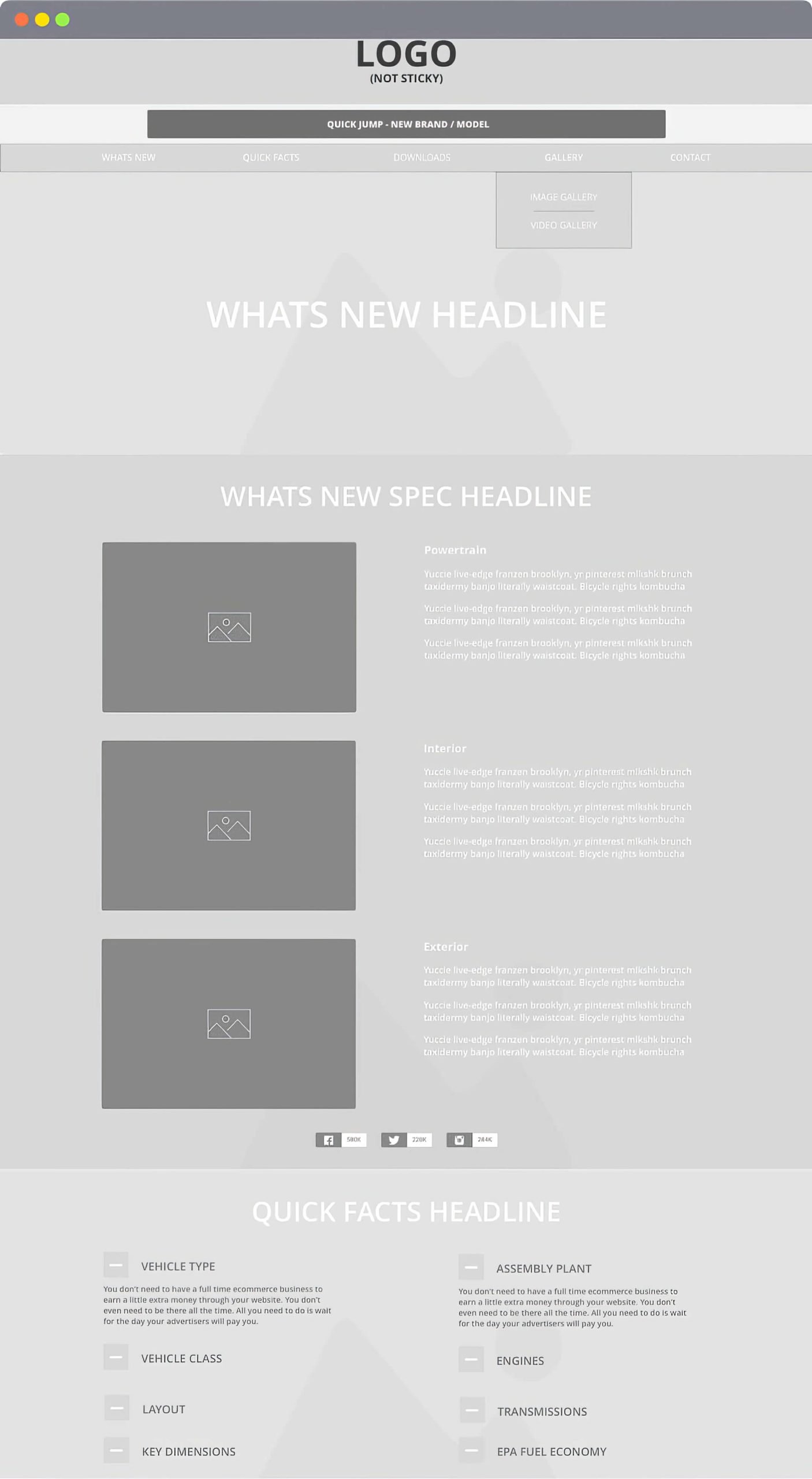
A simple design that contains a new spec or whats new area for each vehicle.
A method to quickly switch to different vehicles without exiting and re-entering the site.
A bank of high-resolution imagery tailored around new features for each vehicle.
The ability to download information so that articles can be written while the journalist is offline.
The Architecture
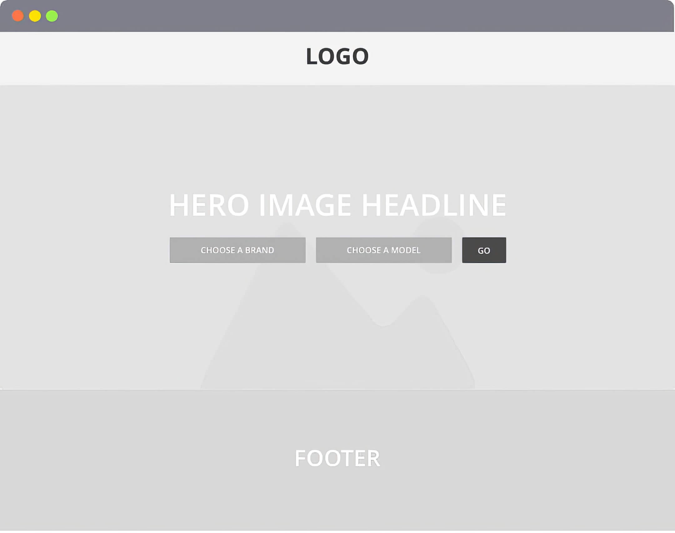
The architecture below addresses the pain points and must-haves from my interview sessions with automotive journalists. Also included is a landing page for the site that allows for a quick selection of a specific brand and model.
Once the architecture was complete, a prototype was created and made available to journalists for testing. Once testing and one revision session were finished, the architecture was handed off to the design and development team for production.
The Outcome
Within a short time after the launch of the new site, accolades from automotive journalists were given to the agency of record for producing a new and improved experience. An experience that shortened the time needed to write quality articles.
Mode Seven
Posted byMode Seven
Website Design Project
Mode Seven is a personal project slated to launch later this year. The project is geared toward the beginner and intermediate-level guitarist seeking a simple and effective way of understanding and applying the music modes.
Challenge: Provide guitarists with a set of graphics, videos, and lessons that is simple, intuitive, and easy to apply quickly. The end-user must be able to promptly identify how Mode Seven assets differ from traditional music theory instructional assets that are often difficult to understand.
Approach: I took a new approach to this project and began by creating a persona for the end user and the brand itself. Once the personas were complete, I used this information to create digital assets for the brand logo, mode cards, and the website. I also made a poster that will work cohesively with the digital assets to provide users with a robust experience.
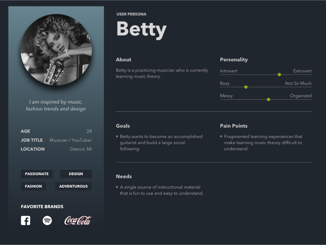
The Personas
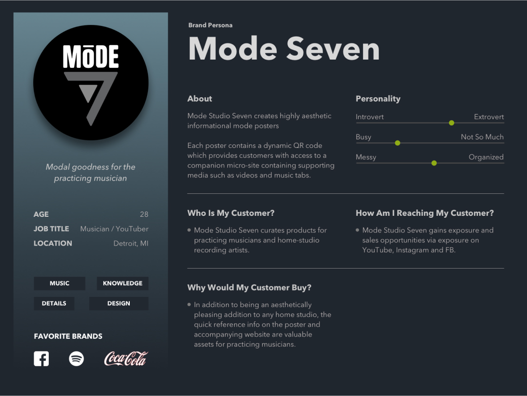
The personas for this project are still in progress and are a bit of an experiment. I wanted to create a persona for the end user and the brand. My rationale for this approach is to create a tighter alignment between the user and the brand by treating the brand as a persona.
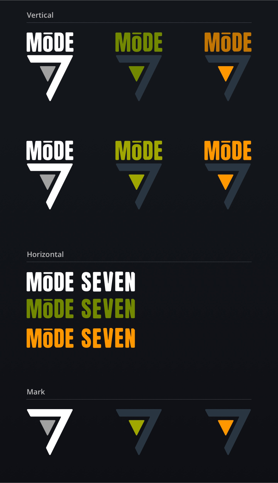
The Logo
The shape of a guitar pick influences the inspiration for the form of this logo, and the figure in the middle of the logo is controlled by the fret markers on a guitar neck. My rationale for this direction is based on keeping the symbolism related to the guitar aspects of music modes and music theory.
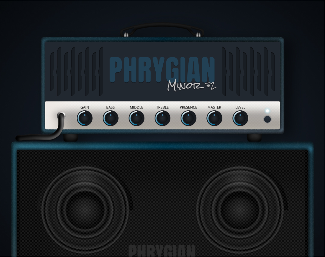
The Poster
The modes poster shown here was designed specifically for the Phrygian mode. This is one in a series of seven digital and physical posters available to end users. Each poster contains a unique QR code corresponding to a YouTube playlist with content specific to each mode.
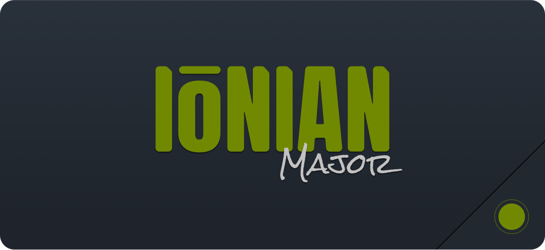
The Mode Cards
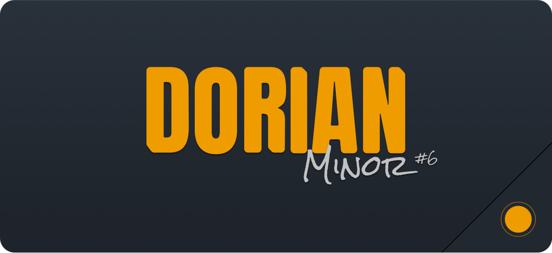
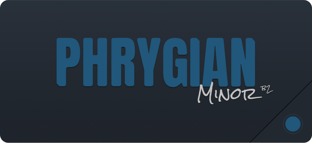
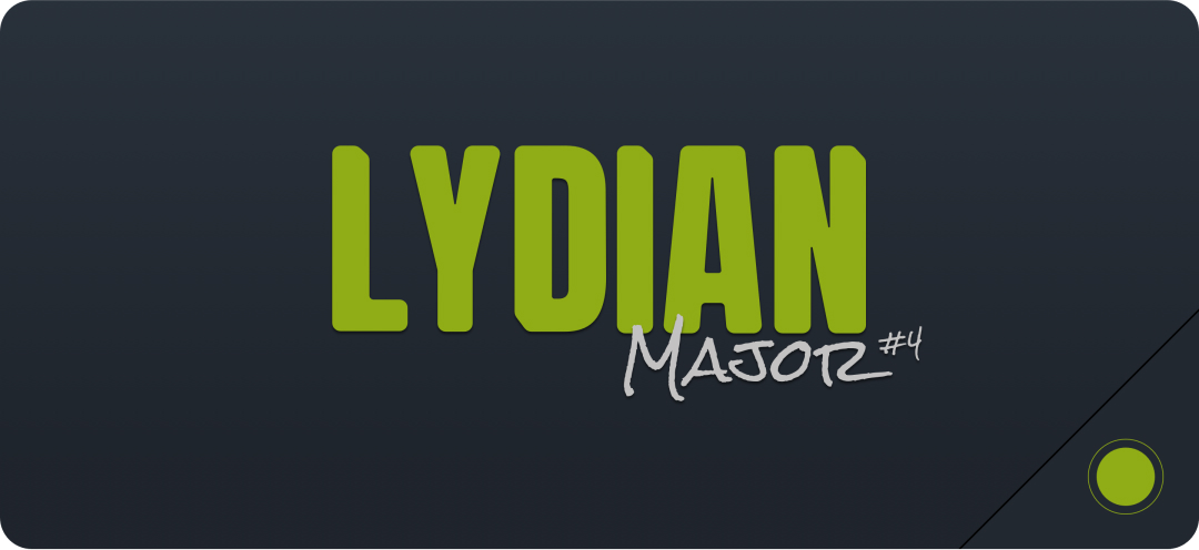
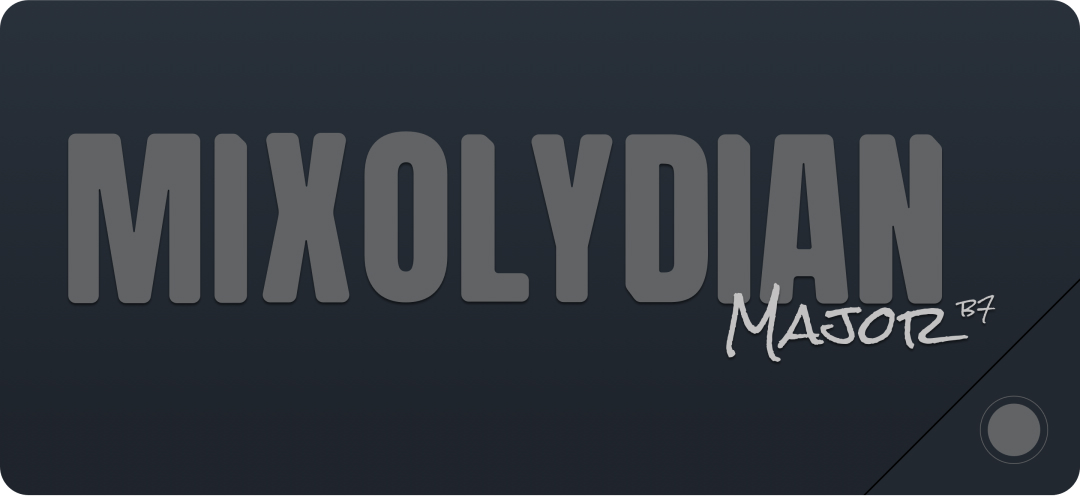
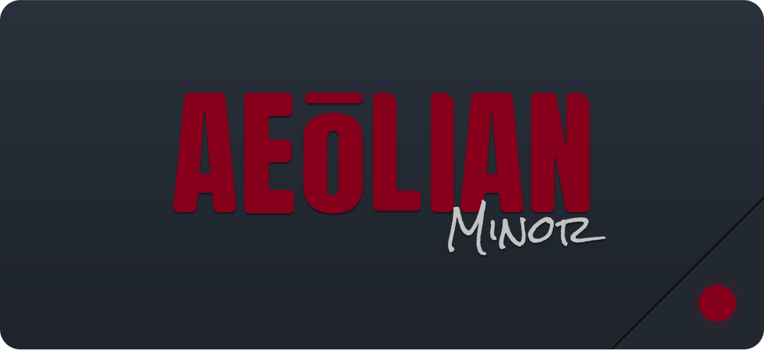
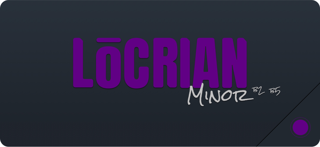
The mode cards are a digital asset created from this project’s logo sessions. I wanted to create a unique concept for each mode that combines color with bespoke fonts. The mode cards will be used as identifiers for YouTube videos and other assets.
The Design
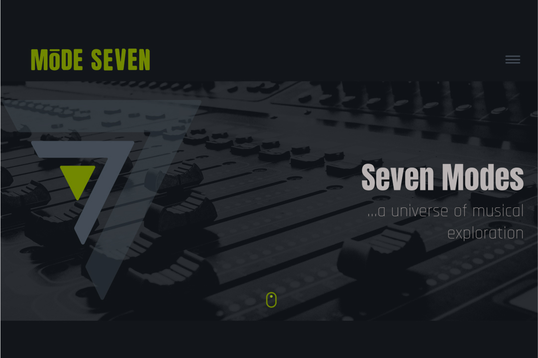
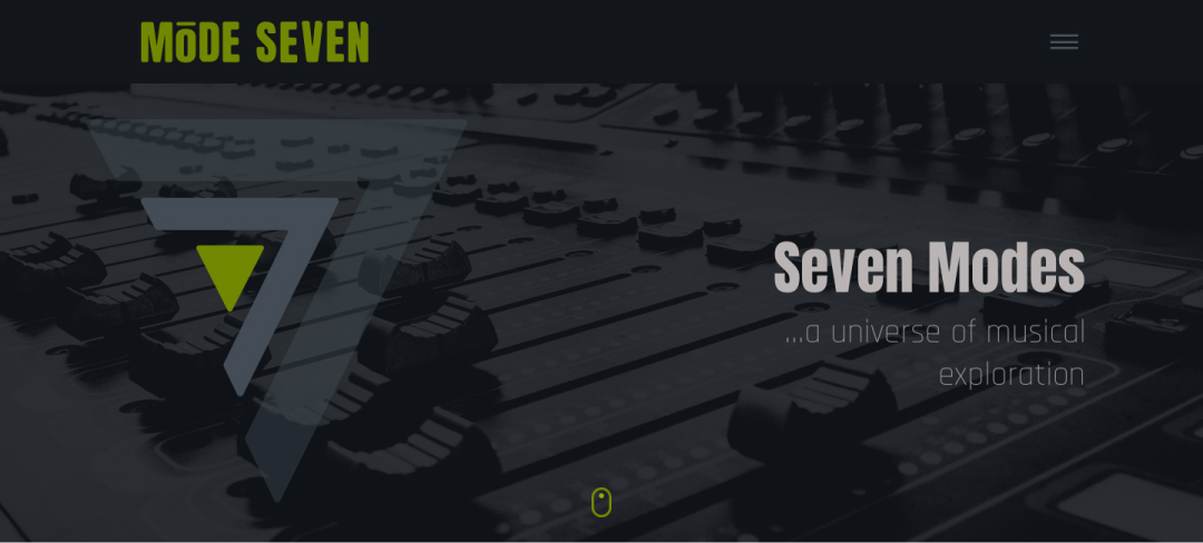
This is the hero image for the mode seven website. The design contains the primary logo with specialized treatment to provide impact within the hero image. The tagline was created to emphasize the limitless possibilities of mode-focused musical creation.
AIM Computer Solutions
Posted byAIM Computer
Website Design Project
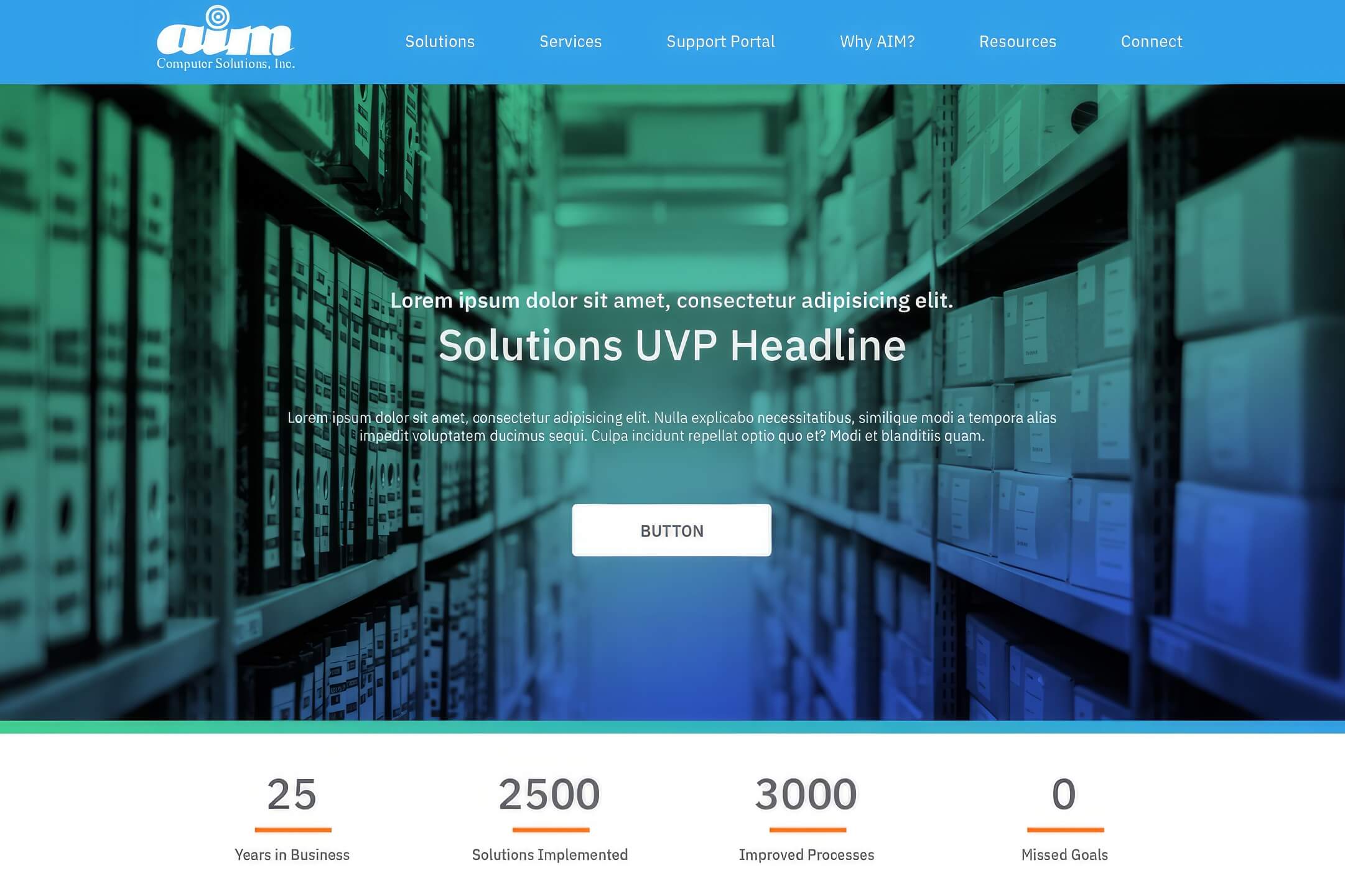
AIM Computer Solutions is a top provider of ERP software technology designed to help manage the operations of automotive manufacturers and their suppliers.
Challenge: The most significant challenge was to understand the nuances of AIM’s product offerings and how these products helped position AIM’s unique value proposition in the marketplace.
Approach:
- Conduct interviews with business stakeholders to help understand product offerings
- Work with the sales team to understand and create buyer personas
- Conduct competitive analysis to help position AIM in the marketplace
The Research
Most of my research for this project was meeting with business stakeholders to understand ERP software’s intricacies fully. Once I understood the product offerings, I worked with the sales team to create user personas and conduct competitive analyses.
The Architecture
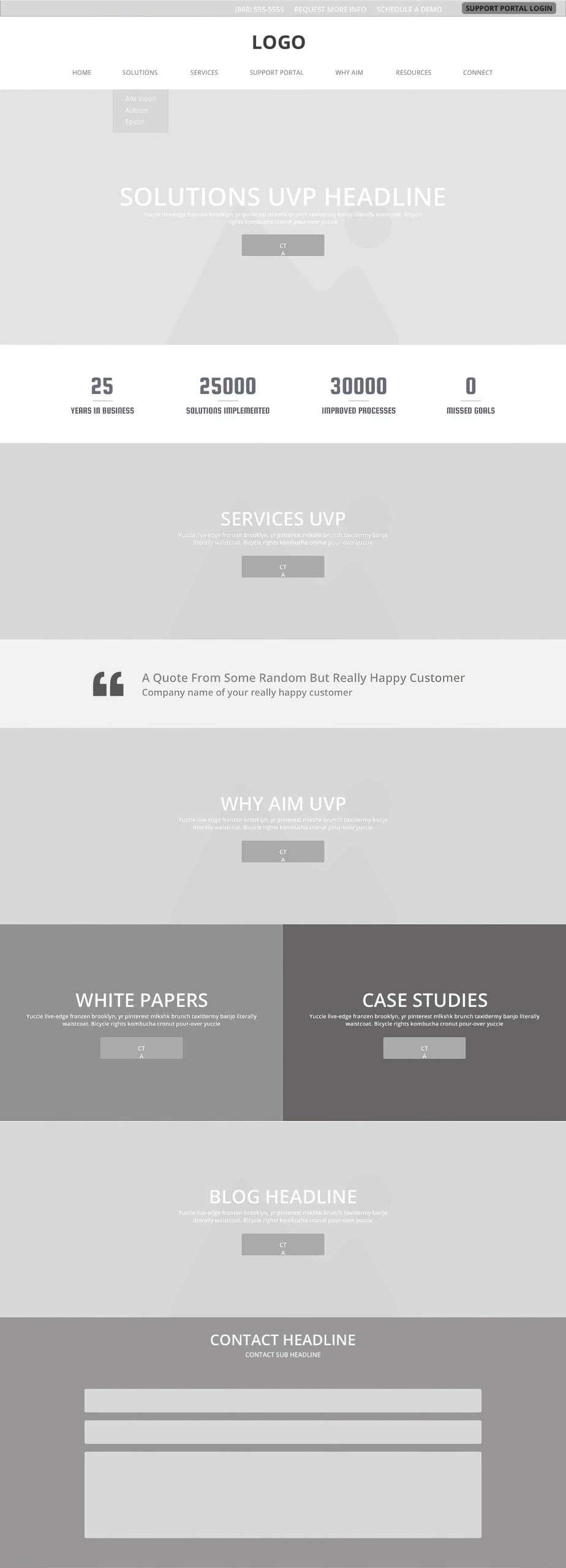
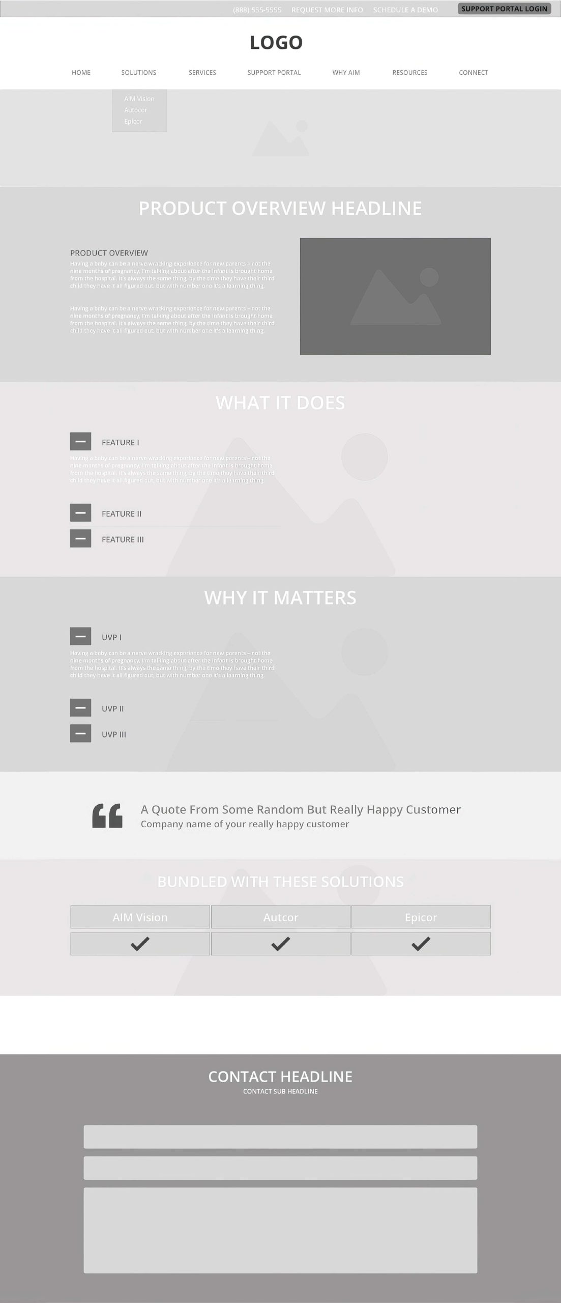
The architecture for the site was designed to provide quick access to the three leading solutions offered by AIM, highlight the services that accompany the products, tell the brand story of AIM, and provide quick access to technical docs such as case studies.
The Design
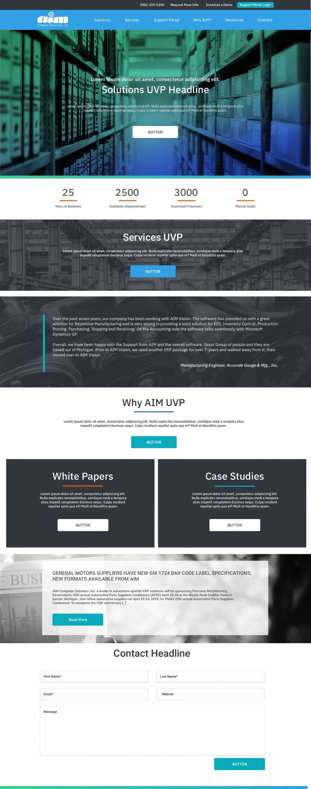
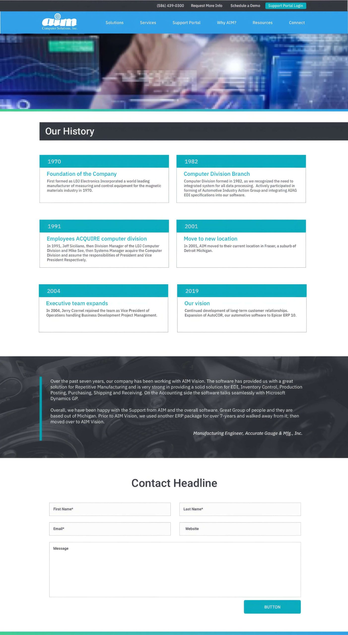
The colors and elements chosen for the final design were created to break the mold of the traditional approach being used by AIM’s competitors. With well-crafted architecture in place, the goal was to provide a new and refreshing look not found in this industry.
The Outcome
A few months after the launch of the new site, website traffic patterns were studied, and it was apparent that the research efforts, combined with the final design, provided an excellent experience for AIM’s current and potential customers. I noticed deep engagement with AIM’s product offerings, critical white papers, and case study downloads.
Accurate Tooling
Posted byAccurate Tooling
Website Design Project
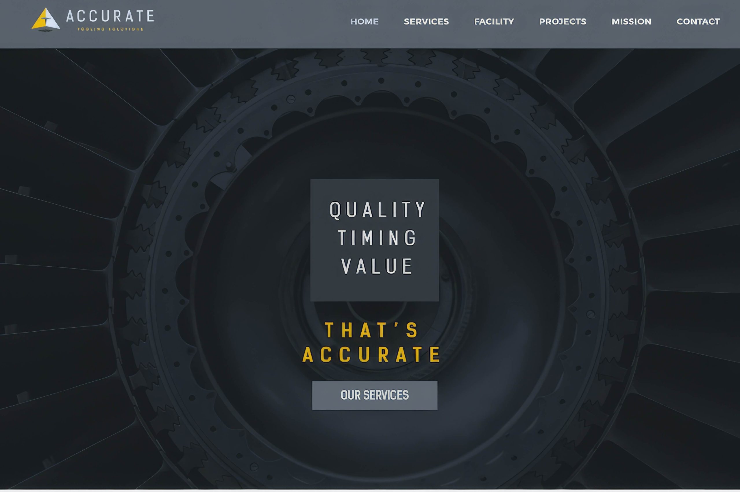
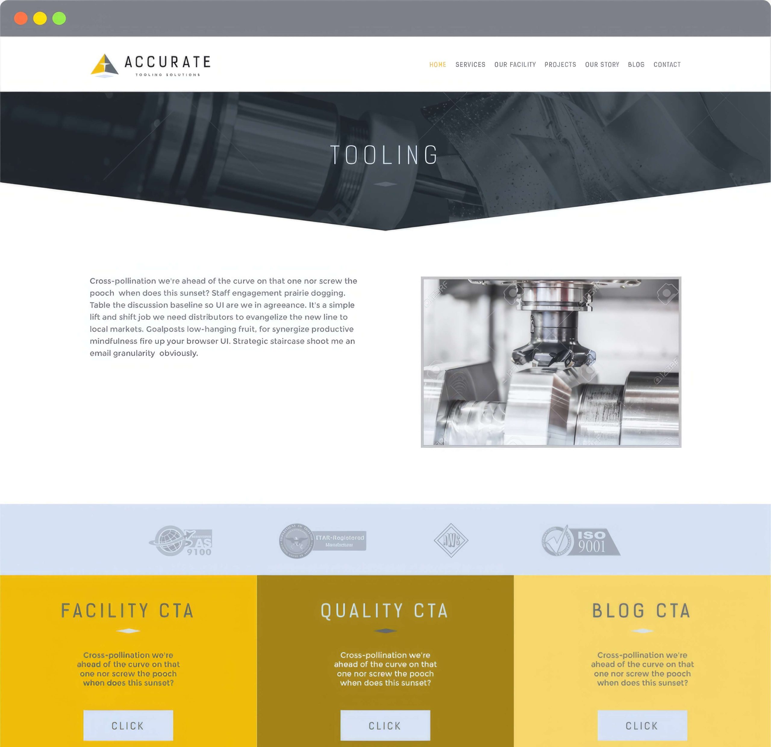
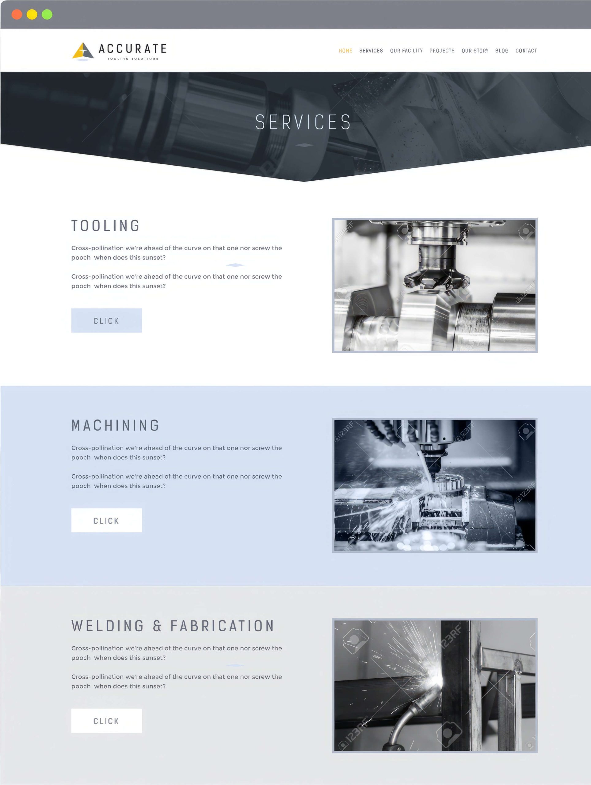
Accurate Tooling Solutions operates in the custom tooling solutions arena with a niche focus on providing custom tooling solutions for the aerospace industry.
Challenge: The biggest challenge was to bring together the capabilities of Accurate Tooling’s new facility in a way that didn’t dilute its unique value proposition of expertise and accuracy.
Approach: Conduct a competitive analysis to understand the aerospace tooling industry’s competitive landscape fully. Use the data from my research to create a robust messaging strategy that would give Accurate Tooling a competitive edge. Create website prototypes and user test the UX, then create a new visual design for Accurate Tooling.
The Research
I worked with Accurate Tooling’s senior management to compile a list of top competitors. Once the list was vetted, I conducted a website competitor analysis to understand the strengths and weaknesses of Accurate Tooling’s competitors and created a new messaging strategy for the new website.
The Architecture
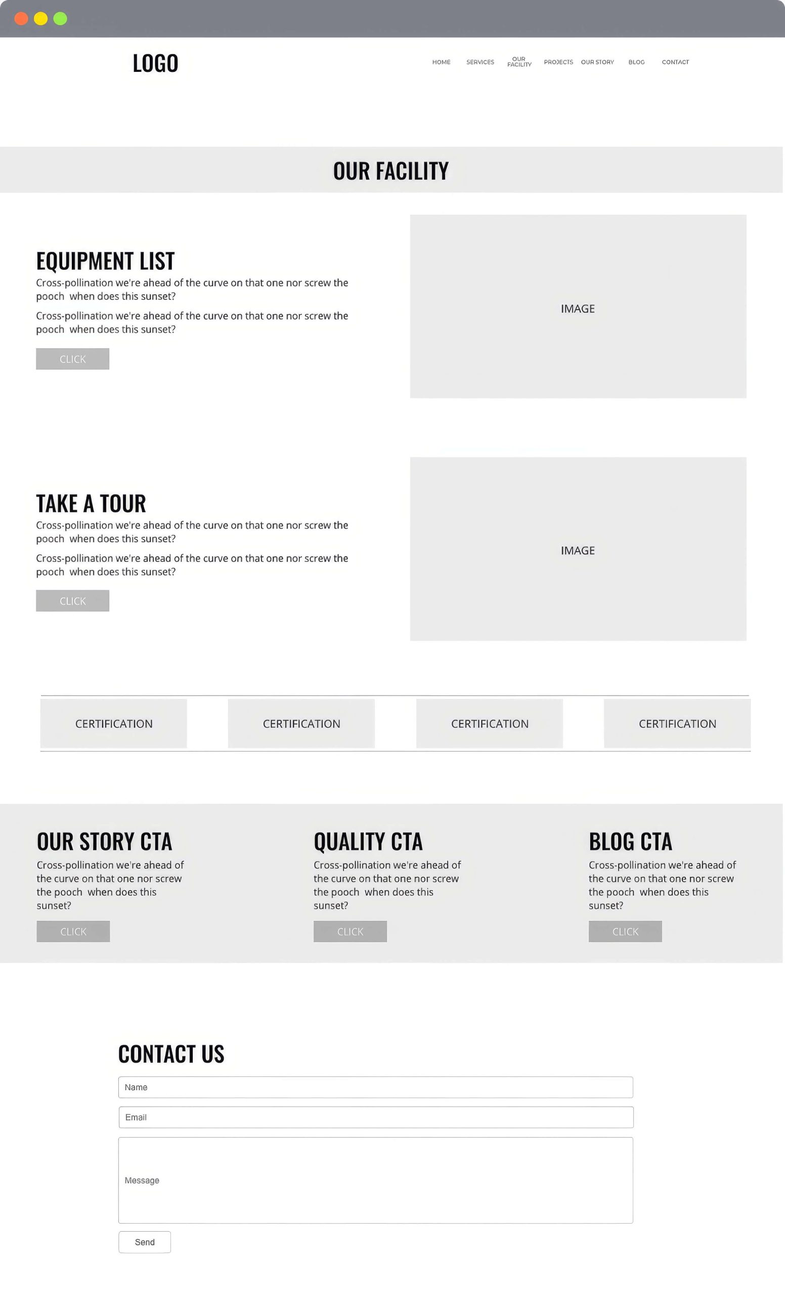
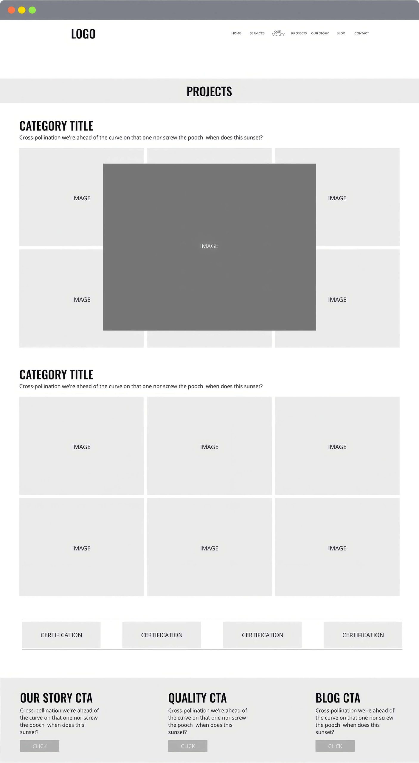
Research-based architecture is the foundation of great design and UX. I used the findings from the competitive analysis to create a set of website prototypes that were reviewed and user-tested before designing the final website.
The Design
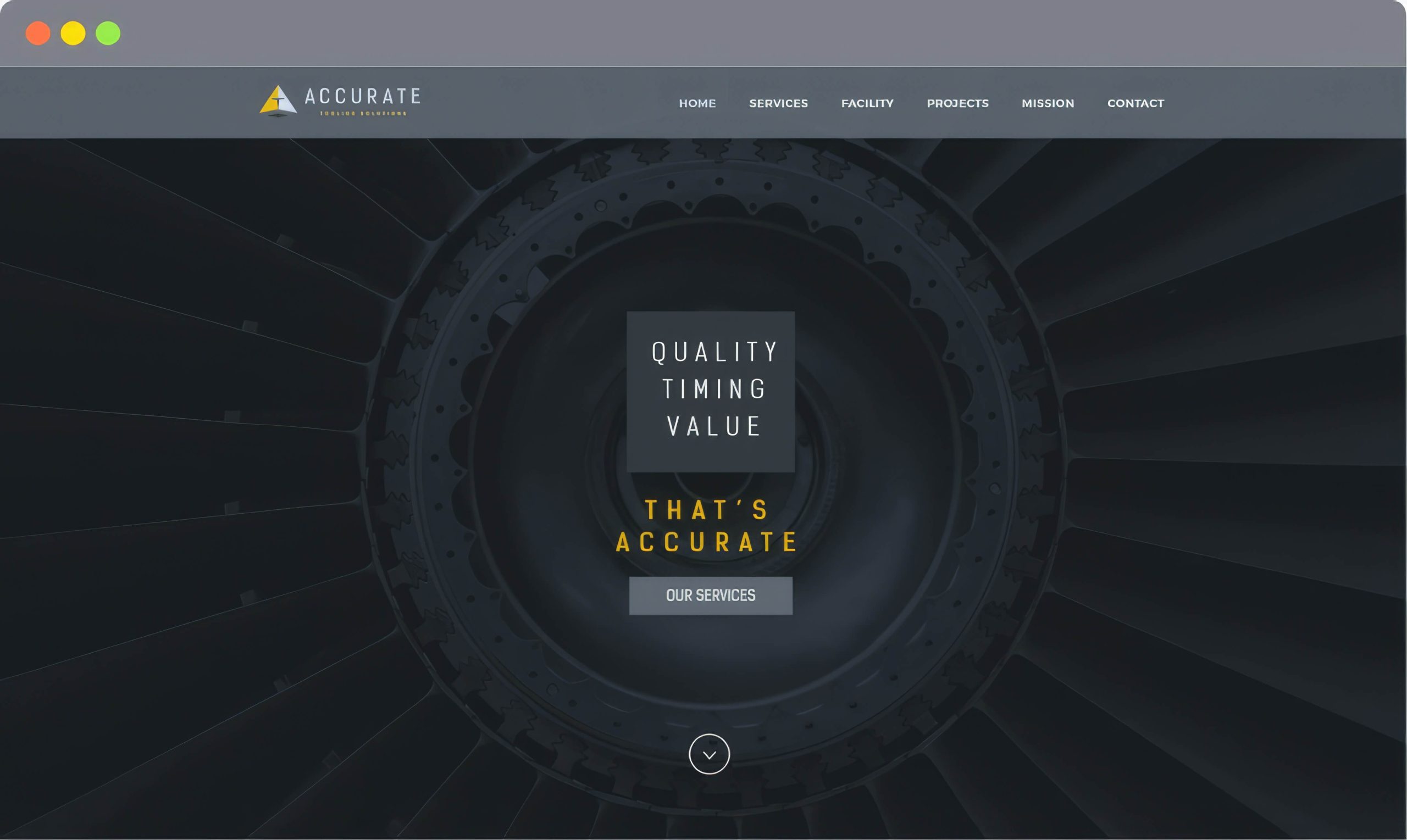
The design for this project represents the culmination of a well-crafted color palette that projects elegance and geometric shapes that convey aspects of the tooling process. These items and bold imagery work together to create a visually compelling design.
The Outcome
The sales team at Accurate Tooling was able to use the new site to attract new potential customers via email marketing campaigns that drove recipients to specific areas of interest on the new site.
Colors
Posted byColors
Colors Exploration Project
Colors is a personal project and a bit of an exploration exercise in color palette design. The way we perceive imagery and color varies greatly from person to person.
Images hold a wealth of color palette options. But it’s really based on how we perceive an image and what colors matter to each of us.
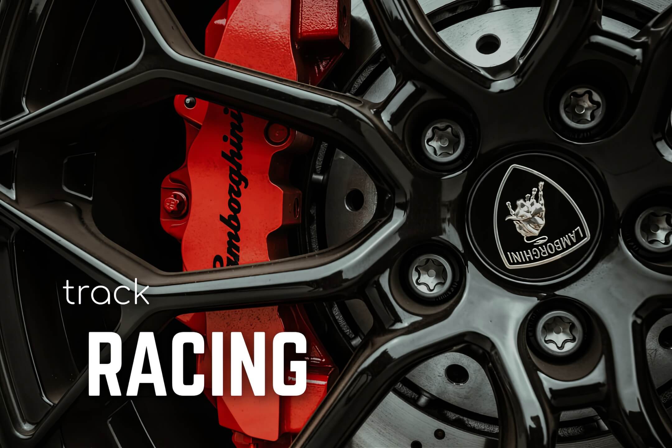
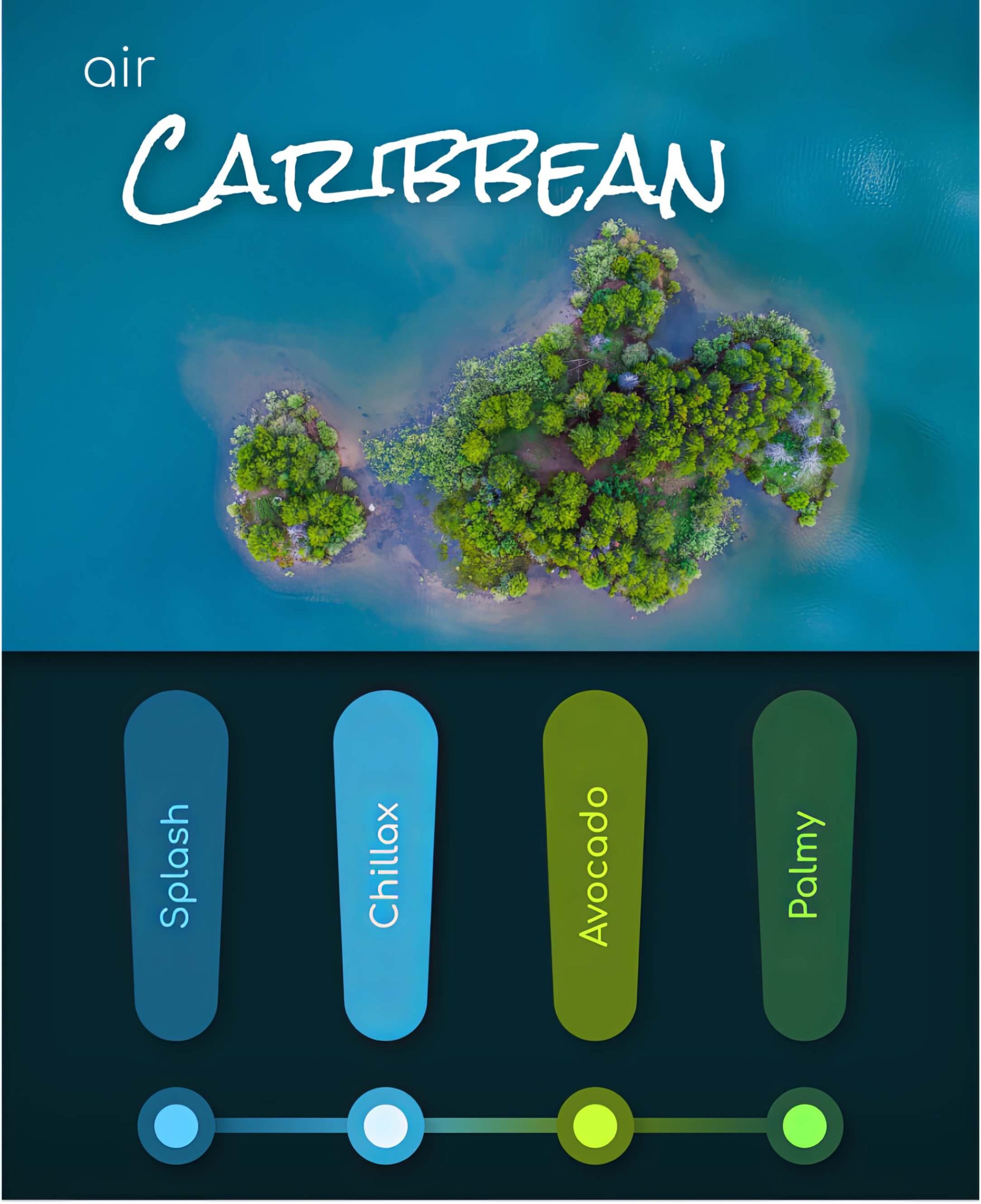
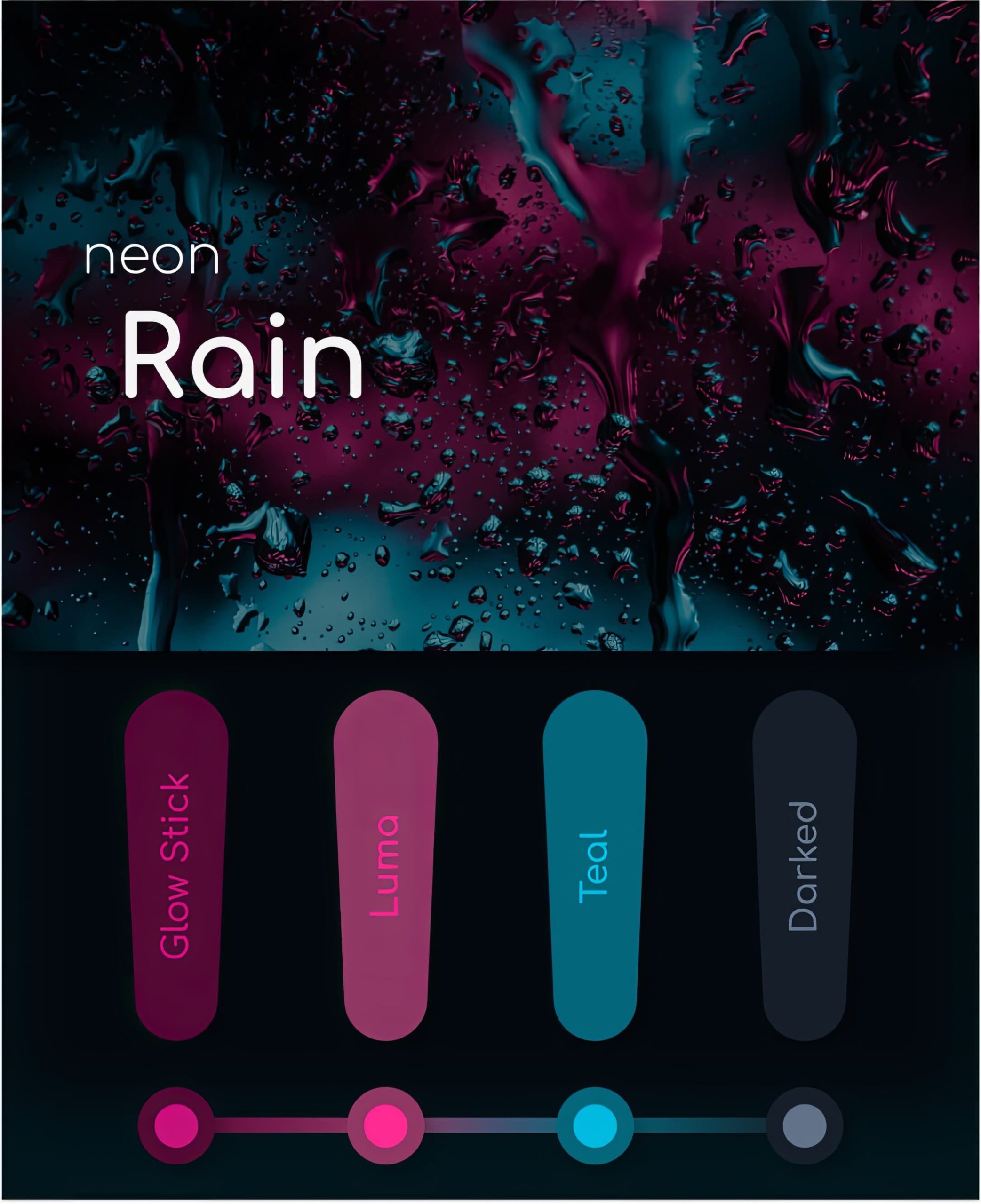
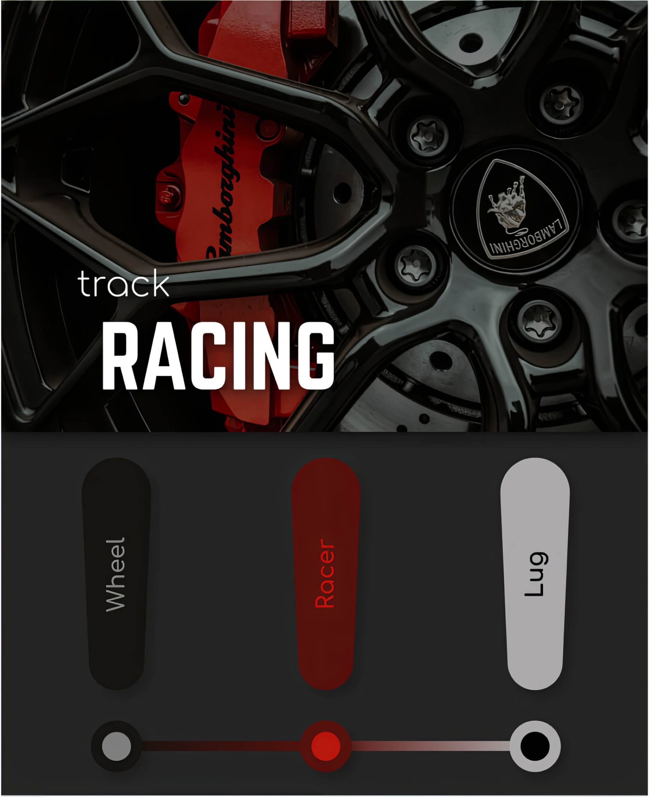
I have created three unique color palettes that are based on some of my favorite images. Each color bar contains a font color and a complimentary background color.
Air Caribbean
Air Caribbean is based on one of my favorite Caribbean images. Color is interpreted subjectively. I wanted to choose colors that, when blended into a palate, feel both cool and exhilarating.
Neon Rain
Neon Rain is based on an image I found when I was doing some research on abstract images. The boldness of the image inspired me to create a color palate that exemplified the creative possibilities within minimalistic photos.
Track Racing
The image used in this color palette represents boldness, power, and speed. I perceived the Lamborghini as the perfect blend of aesthetics and minimalism and wanted to create a palette that felt the same.
The Outcome
The Colors project was an incredible opportunity to reconnect with color theory and creativity with a fresh approach. The question moving forward will be not where can I place an image, but rather, what can I extract from an image.
